Ever since the federal government’s controversial 2014 budget, inequality has been a central theme of Australian political debate. Concern has also intensified internationally, with agencies including the World Bank, the Asian Development Bank and the International Monetary Fund conducting research and making recommendations. In 2015 the OECD established a Centre for Opportunity and Equality to delve into the causes and consequences of inequalities and generate discussion about policy options.
But not everyone agrees we need to be worried. In March, at the annual dinner of the Sydney Institute, former prime minister John Howard argued that the Labor Party and the union movement were “perpetuating an election myth over inequality” to justify a “tax grab.” “Australia still has the strongest and wealthiest middle class in the world,” he went on. “One of the things that hasn’t fundamentally altered is that we are still a very middle-class society… We are still the biggest middle class (per capita) in the world and people aspire to the middle class.”
The editor of the Australian Financial Review, Michael Stutchbury, took a similar line earlier this month when he focused on the labour market: “Nine of every ten jobs created over the past year were full-time,” he wrote. “Real wages are 20 per cent higher than fifteen years ago, giving workers their fair share of productivity gains, even amid a generous intake of immigrant workers and refugees. There has been no significant increase in inequality. Australia retains one of the world’s highest minimum wage floors.”
As David Hetherington of Per Capita has asked, “What is going on here? How can both sides claim the facts with such certainty?”
Measures, surveys and time spans
Any assessment of trends in inequality must inevitably deal with technical issues. What types of inequality are being measured? Where is the data coming from? Which periods are we talking about?
In Australia, the most important source of data on income and wealth is the Survey of Household Income and Wealth conducted by the Australian Bureau of Statistics, or ABS. Taken together with earlier, similar surveys, it extends back to the 1960s, although detailed data collection only began at the beginning of the 1980s. The other major source is the Household, Income and Labour Dynamics in Australia, or HILDA, survey, whose latest statistical report analyses how things changed for Australians between 2001 and 2016.
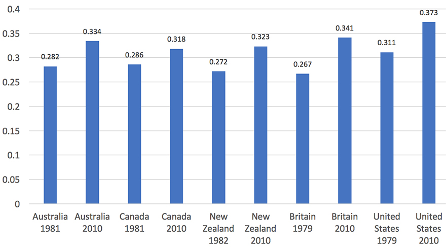
Chart 1 compares these two sources over the twenty-one years up to 2015–16, the latest year for which figures are available. In each case, income inequality is represented using the most commonly used measure, the Gini coefficient. The Gini coefficient ranges from zero, or absolute equality (at which point all households would have the same income), to one, or absolute inequality (where a single household has all the income).
Chart 1: Trends in inequality in Australia, according to two data sources using the Gini coefficient, 1994–95 to 2015–16
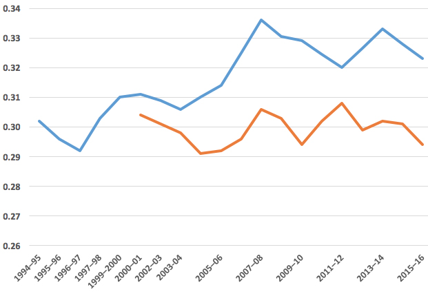
Sources: The Household, Income and Labour Dynamics in Australia Survey: Selected Findings from Waves 1 to 16, 2018; Australian Bureau of Statistics Survey of Household Income and Wealth.
The level of inequality found by the ABS (blue line) is higher than HILDA’s findings (red line) and has increased more over the period since 2001, when comparisons first became possible. In fact, HILDA finds that incomes were slightly more equal in 2016 than in 2001 — a finding that is often cited to support the view that inequality is not increasing.
Chart 2 compares income trends in the two data sources. Again, there is a divergence, with the ABS showing much greater increases in real incomes since the turn of the century. According to HILDA, real median and mean incomes were about 30 per cent higher in 2016 than in 2001. According to the ABS, real median incomes were about 40 per cent higher and real mean incomes close to 50 per cent higher.
Chart 2: Trends in average household incomes according to the ABS and HILDA, 2001–16 (2001=1)

Sources: The Household, Income and Labour Dynamics in Australia Survey: Selected Findings from Waves 1 to 16, 2018; Australian Bureau of Statistics Survey of Household Income and Wealth.
Why the different trends and levels of inequality? When Matt Taylor of the ANU Centre for Social Research and Methods recently compared the two datasets in the Australian Economic Review, he found that the difference partly reflects the broader definition of income used by the ABS, which now includes non-cash fringe benefits, bonuses, termination payments and payments for irregular overtime. By more accurately capturing benefits accruing to employed people — particularly those with work-related fringe benefits — the ABS definition yields higher incomes and greater inequality.
This suggests that earlier ABS data on inequality, using a narrower definition, underestimated its extent. But that effect isn’t large: using the broader measure, income rose by 27 per cent between 2003 and 2007, whereas the older measure has the figure at just over 23 per cent. The increase in the Gini coefficient under the older measure would have been 0.020 rather than 0.025.
The HILDA survey exists for a different purpose. It has followed around 17,000 individuals since 2001, giving an invaluable picture of what happens to people over time. But a longitudinal survey like this suffers from the fact that participants often drop out, reducing the representativeness of the sample. (The survey was topped up in 2011, partly alleviating that problem.) Over time, between top-ups, the survey will also become less representative of newly arrived migrant groups and young adults. And HILDA’s sample size is only a bit more than half the size of the ABS sample, which covers more than 27,000 people, and will have correspondingly larger sampling errors.
In other words, the ABS surveys are likely to be more reliable — and they have the added attraction of following trends back to the early 1980s.
How have the benefits of income growth been shared?
Using the ABS data, we can look in more detail at how different groups at various points on the income distribution have fared. One simple way of doing this is to look at different “decile points.” A household at the first decile (or the tenth percentile), for example, has a higher income than exactly 10 per cent of households with lower incomes, while a household at the ninth decile (or ninetieth percentile) receives more income than all but the richest 10 per cent of households.
Chart 3 shows changes in incomes at different decile points. As is clear, real income growth was much higher in the period leading up to the global financial crisis, with incomes at the top of the poorest decile increasing by 29 per cent, and at the bottom of the richest decile by 45 per cent. (Households above the ninetieth decile would have received even bigger increases.) The period since 2008 is strikingly different. The median income has increased by only 3 per cent over the entire eight-year period, or about one-thirteenth the rate in the previous period, with the ninetieth percentile increasing only marginally more.
Chart 3: Change in real disposable income at decile points, Australia, 2000–01 to 2015–16
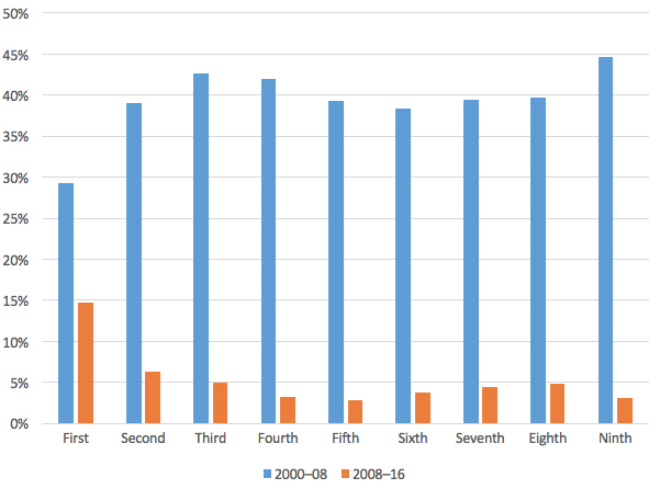
Note: Income figures are “equivalised” to reflect differences in household composition.
Source: Australian Bureau of Statistics Survey of Household Income and Wealth.
Real incomes among the poorest 10 per cent have increased by around 15 per cent, though, and in the second decile by around 6 per cent, leading to the slight fall in inequality over this period. Over the full two periods, incomes at the first decile have increased by just under 49 per cent while the increase at the ninth decile is almost exactly 49 per cent.
As the saying goes, the rising tide seems to have lifted all boats. The Australian Financial Review certainly thinks so: it argues that the Productivity Commission’s 2018 report, Rising Inequality? A Stocktake of the Evidence, shows that “economic growth has made everyone in Australia in every income group better off.”
Well, no, it doesn’t.
As the Productivity Commission points out in its discussion of mobility, the incomes of households and individuals within the various deciles fall as well as rise. Put simply, not everyone — in fact, only about 1 per cent — stays in exactly the same place in the income distribution over long periods. More than 40 per cent of the Australian population were in a lower income group in 2016 than they had been in 2001, for reasons including retirement, disability, unemployment and family breakdown.
It is also obvious that people on benefits whose payments are linked to the consumer price index can’t, by definition, have had an increase in real incomes of close to 50 per cent. Single adults on Newstart, although they are not the same people as in 1994, have fallen down the income distribution over the past twenty-five years, from within the bottom 10 per cent to within the bottom 5 per cent. In 1994–95, a single person on Newstart received $24 per week less than a low-earning household at the top of the bottom decile. By 2015–16 that single person on Newstart was receiving $175 per week less than the low-earning household.
Real payments have also been cut for lone parents with children of school age or older. In 2013, the Gillard government required all single parents with older children to be moved onto Newstart or other payments (or off benefits altogether). The maximum rate of the parenting payment for a single person was $331.85 per week at the time, and the maximum rate of Newstart was $266.50.
The Productivity Commission was at pains to point out that the stabilisation and slight decline in overall inequality over the past decade is largely the result of specific government decisions rather than market forces.
One of the most important reasons for falling inequality since 2008 has been the one-off increase in age pensions made by the Rudd government in 2009. ACOSS’s 2016 Poverty in Australia report found that the relative poverty rate (before housing costs) for people aged sixty-five and over fell from around 30 per cent in 2007–08 to 11 per cent in 2013–14 because of that “historic increase” in pension rates.
ABS income surveys also show that the average incomes of households headed by people aged sixty-five and over climbed by 16 per cent in real terms between 2007–08 and 2015–16. (The increase was about 3 per cent for the population as a whole.) As a result, the average incomes of older households jumped from 69 per cent to 78 per cent of those of households generally. While economic prosperity was needed to fund that increase, it didn’t automatically fund it. That needed deliberate government intervention.
But the decline in inequality brought about by that intervention is likely to have masked increases in inequality among other households, which are the result of interactions between changes in the labour market, the stock market, incomes from rents, employment, unemployment and underemployment, wages, and government tax and benefit policies. (And that’s not an exhaustive list.)
Since the global financial crisis, says the ABS, the number of underemployed workers — people working part-time and wanting more hours — has climbed from about 680,000 to 1.1 million, or from 6.3 per cent to 8.9 per cent of the workforce. The ABS also finds that wage disparities have increased. The ratio of the earnings of a worker at the ninth decile to the earnings of a worker at the first decile grew from 7.75 times in 2008 to 8.24 times in 2016, the result of widening wage differentials for both full-time and part-time workers and an increase in the proportion of part-time workers.
In other words, a reduction in overall income inequality is perfectly consistent with rises in household income for some groups and falls for others.
The period under analysis is also important. Australian Financial Review editor Michael Stutchbury, for instance, mixes data covering several different periods — sixty years, fifteen years, between last year and this year, and an unspecified period in which there was “no significant increase in inequality” — to argue that there is nothing to see here in the fairness debate.
Possibly the best characterisation of the latest ABS figures is that inequality remains higher than at any time in the decades before 2007–08, and it is unclear how long it will stay stable.
What about our “strongest and wealthiest” middle class?
Former prime minister John Howard described Australia’s middle class that way in his Sydney Institute speech. Australia is doing well in the fairness stakes, he said, because we have the “biggest middle class (per capita) in the world.” Surely this contradicts the ABS findings?
Mr Howard appears to have been drawing on the latest Credit Suisse Global Wealth Report, which shows that Australia has the highest median wealth in the world. But that report also points out that an unusually large share of our wealth is in the form of housing whose value is inflated by excessive home prices in the largest cities. Put another way, we have high (and relatively equal) wealth because many of us own expensive houses.
A clearer idea of the current condition of Australia’s middle class comes in a new OECD report, Under Pressure: The Squeezed Middle Class. The OECD defines the middle class as those households who have a disposable income of between 75 per cent and 200 per cent of the median (or mid point of the income distribution). This is after-tax income in 2015–16, adjusted for household size.
In Australia that translates to a disposable income of between $33,300 and $88,700 for a single person, and $66,600 and $177,400 for a couple with two children. That’s quite a low threshold for the middle class: a single person would only have to earn about 5 per cent more than the minimum wage to sneak in, although they would have had to be working full-time for the whole year.
Defining the middle class solely according to income obviously differs from sociological approaches based on the types of job held by members of a household. On this measure, the contrast between middle-class and working-class is clear, writes British sociologist John Goldthorpe:
A wage-worker in Class 6 or 7 [the working classes] has a relatively high risk of job loss and especially of recurrent or long-term unemployment, has weekly earnings that often vary widely with piece rates, shiftwork premia, the availability of overtime, etc., and, most importantly, has little prospect of real earnings progression after around age 30–35. This person is living in a significantly different economic world from a salaried employee in Class 1 or 2 who has a relatively high degree of job security, a known amount of pay going into the bank each month, and the realistic expectation of salary increases, via incremental scales or promotion, up to age 50 or beyond.
Many aspects of this description also characterise the Australian labour market.
What does the OECD report show? On average across OECD countries, the proportion of people in middle-income households fell from 64 per cent to 61 per cent between the mid 1980s and the mid 2010s. The economic influence of the middle class and its role as a “centre of economic gravity” also weakened. Overall, median incomes have increased a third less than the average income of the richest 10 per cent over the past thirty years. In parallel, the cost of essential elements of the middle-class lifestyle have increased faster than inflation; in particular, house prices have been growing three times faster than household median income over the past two decades.
Australia’s middle class, at 58 per cent of the population, is actually smaller than the OECD average of 61 per cent. Australia has more people at both ends: a slightly higher proportion of low-income people, and a higher proportion earning more than twice the median (nearly 10 per cent of households compared to just over 4 per cent, for example, in Denmark). But about 61 per cent of Australians consider themselves to be middle class, compared to 85 per cent in Denmark and Iceland, and only 42 per cent in Britain.
The countries with the greatest share of middle-income households are the less unequal Nordic countries — Denmark, Sweden, Norway and Finland — and some central European countries, where the share is closer to 70 per cent. Virtually by definition, the more unequal a country the smaller its middle-income group. Countries with very high inequality, like South Africa and Brazil, have many poor households and a large number of rich households, and a smaller share in the middle.
While Australia’s middle class is smaller than the OECD average, is that lag in performance offset by our high level of wealth? This question highlights the importance of looking at differences by age: after all, you don’t necessarily drop out of the middle class on retirement even if your income drops below two-thirds of the median.
Less than half of Australian households with a head aged sixty-five and over have incomes above two-thirds of the median. Practically none have incomes more than twice the overall median. Adjusting for this factor makes a limited difference, because counting older people with reasonable wealth as middle class also means identifying more working-age households as belonging to the affluent class.
Other aspects of the OECD report also suggest that Australia has no reason to be complacent. It shows that part of the explanation for the fall in middle incomes is the declining number of “middle skill” jobs. Between the 1990s and 2015, that decline was actually stronger in Australia than in most other OECD countries.
In addition, middle- and lower-income households appear to be more likely to fall into poverty in Australia than in most other countries. Their probability of falling into poverty from one year to the next (on average for the period 2007–15) was around 4 per cent in Australia, or roughly twice the OECD average and four times the figure for countries like Denmark and the Netherlands. For individuals who are neither poor nor “middle class” — people on incomes between 50 per cent and 75 per cent of the median — the probability of falling into poverty, at close to 15 per cent, was the second-highest in the OECD. This partly reflects the fact that unemployed people in Australia receive the lowest equivalent rate of benefit in the OECD, once account is taken of housing costs.
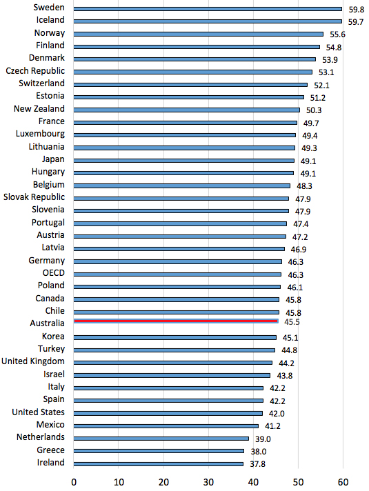
Another way of looking at the middle class is from the perspective of labour-market and pay status. Chart 4 shows the percentage of the working-age population (aged sixteen to sixty-four years) who are working full-time and earn more than two-thirds of median earnings. While Australia’s overall employment rate is high by OECD standards, our share of part-time workers is the third-highest in the OECD.
The chart shows that the share of full-time well-paid workers (both male and female), at 45.5 per cent, is below the OECD average, exceeding only twelve of thirty-seven countries. The countries with the highest shares of full-time well-paid jobs are largely the same as those with the highest share of middle-class households — mainly the Nordic countries. Indeed, the OECD report on the “squeezed middle” specifically notes that part-time workers are seldom the heads of middle-income households. Among seventeen OECD countries with available data, only 8 per cent of middle-income working households are headed by part-time workers.
Chart 4: Share of population of working age in full-time jobs earning more than two-thirds of median income, 2015
Note: Calculation assumes that Sweden and Iceland have the same share of low-paid full-time workers as Norway and Finland.
Source: Calculated from OECD employment database and wages database.
Australia has continued to perform relatively poorly in this regard since the global financial crisis, with the proportion of the working-age population in full-time well-paid jobs falling by a little over two percentage points. The worst-performing countries are in Southern Europe and Ireland, but the Nordic countries have also performed badly (though from a higher base).
Chart 5: Change in share of working-age population in full-time jobs and not low-paid, percentage points, 2008 to 2015
Note: Calculation assumes that Sweden and Iceland have the same share of low-paid full-time workers as Norway and Finland.
Source: Calculated from OECD employment database and wages database.
As the product of a policy think tank, the OECD report identifies policies its authors believe will foster a prosperous middle class. They recommend, among other things, that governments improve access to high-quality public services; ensure better social protection coverage; encourage the supply of affordable housing; and invest in vocational education and training systems.
The report’s authors also want governments to design labour market institutions that ensure productivity gains are shared widely and translate into higher wages and better working conditions, particularly for low and medium earners. They want governments to extend social insurance and collective bargaining coverage for non-standard workers, such as part-time or temporary employees and the self-employed; and they want the tax burden to be shifted from labour income to income from capital and capital gains, property and inheritance, as well as income taxes made more progressive and fair.
Waiting for another boom?
We often hear about Australia’s record-breaking twenty-seven years of economic growth. This supposed economic miracle — you can choose almost any number of months, quarters or years of “unbroken economic growth” — has been celebrated by the Reserve Bank at least since 2000, by the Economist and the BBC in 2017, by the Atlantic in 2018 and, most recently, by the New York Times, which proclaimed that Australia’s “economic picture is one of sustained success.” Contrary views have appeared in the Wall Street Journal and the Guardian, but much of the media and political discussion has been triumphalist in tone.
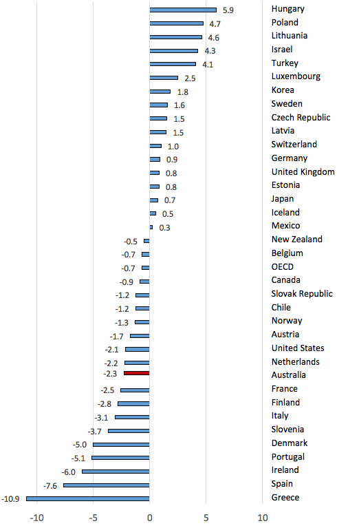
There is much that we can celebrate in Australia, but the level of inequality is not among them. On that measure, our performance is slightly worse than the OECD average, and worse than about twenty OECD countries. The trends in inequality in Australia since the 1980s are not strikingly different from those in other English-speaking countries — with the notable exception of the United States, where inequality has always been much higher.
Chart 6: Change in Gini coefficient in English-speaking countries, around 1980 to 2010
Source: Calculated from Incomes Across the Distribution, by Stefan Thewissen, Brian Nolan and Max Roser, and Household Incomes in New Zealand: Trends in Indicators of Inequality and Hardship, 1982 to 2017, by Bryan Perry.
What is different about the Australian experience is the timing of the increase in inequality. In Britain it came in the 1980s following the election of the Thatcher government; in Canada and New Zealand it came in the 1990s following large-scale austerity programs. Here, inequality increased most in the period between 2003 and 2008 — and virtually all of the increase in real disposable household incomes since 1981 came in the same five-year period, 2003–08, during the first mining boom. Growing inequality in a boom is likely to have different implications for living standards than growing inequality in a recession.
It is not surprising that politicians and some commentators might want to put the most favourable framing on trends in income distribution. It is more surprising when newspapers — particularly those aimed at business figures who presumably want to be advised accurately of economic trends — gloss over the complexities of changing household circumstances. It is not the approach taken overseas by the Financial Times, for example.
Looking ahead, will we be blessed by another boom-led increase in household incomes as we move towards an older population with increased needs for funding pensions and health and aged care? Or might we be less lucky? What is certain is that we will need policies to generate economic growth and policies to ensure it is well spread. •