FROM the day of its launch in 2010 the My School website confronted us with the close link between student achievement and the socio-educational status of their parents and their school population. While the website itself is of mixed benefit, its data continues to throw into sharp relief the differences in educational outcomes around the country.
The latest data from My School offers the clearest illustration of why parliaments around Australia must enact the Gonski reforms to education funding as a matter of urgency. While no one would claim that the NAPLAN tests – the basis of My School – are an adequate measure of educational outcomes, the results are at least consistent, and the picture they present is not one we can afford to ignore.
My School reports average student test scores for every school in Australia. It also breaks down schools according to four locational categories and an Index of Socio-Educational Advantage, or ICSEA, which takes into account the educational and employment circumstances of the children’s families and the remoteness of the school. Put simply, the better educated the parents are, the higher their level of employment and the closer they are to a major metropolitan centre, the higher the ICSEA – and the family-based advantage – of students in the school. We also know from other research that when a school gathers together a large number of students with high socio-educational advantage, that aggregation itself provides an additional, measurable advantage.
Chart 1. Year 5 Reading: weighted average of school scores
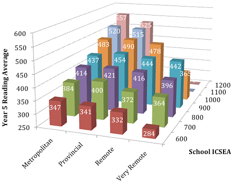
Charts 1–4 are based on data from the 2012 NAPLAN testing, published on the My School website, March 2013
Consider the Year 5 reading test results. The schools involved are either primary schools or what My School calls “Combined” (primary/secondary) schools. The average score on Year 5 reading around Australia in 2012 was 493, with individual state averages varying between roughly 480 and 504. Territory averages varied even more.
Chart 1 sets out the average 2012 Year 5 reading score of sets of schools according to their location and their approximate ICSEA level as reported this year on My School. What the chart shows most dramatically is that students in the most advantaged metropolitan schools scored almost double that of students in the most disadvantaged and remote schools.
Though there are some statistical fluctuations, the same kind of picture emerges from the 2012 Year 5 numeracy test. Here, the national average was 488, again with some fairly wide variations among the states and territories. The same can also be said of results on the writing, spelling and grammar aspects of NAPLAN.
While there are some examples of improvement evident among the detail, the overall picture from the four years of NAPLAN data now publicly available is one of a disappointing and troubling persistence of inequity.
Chart 2. Year 5 Numeracy: weighted average of school scores
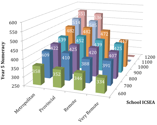
The sets comprise schools with a range of ICSEA values centred on the scale values. Where there are columns missing, it means either that either there were no schools in that category, or there were insufficient to form a usable average.
By way of illustration, there are two striking features of the Year 5 charts. First, it is apparent that for every step of 100 points along the roughly 800-point ICSEA scale, the students’ average score changes by approximately 30 test points. That reflects how much of their learning potential the students bring to the school from their home background – in other words, the values and attitudes to learning they possess, and the resources available to them to promote their educational success.
The second striking feature is the effect of distance. Although remoteness is already factored into a school’s ICSEA, there is still a noticeable decline in performance as we move from the metropolitan and provincial schools to the remote and very remote schools, especially among the least advantaged.
When we look at the secondary situation, the picture becomes more complex. In the first place, there are far fewer secondary schools, hence there are more gaps and fluctuations in the data. Nonetheless a picture does emerge, as charts 3 and 4 show. The family-based advantage persists as we move up the ICSEA scale, as does the advantage of proximity to the metropolitan areas for the least-advantaged students. Interestingly, ICSEA-comparable provincial schools do as well as, or better, in both reading and numeracy than their metropolitan cousins across the middle portion of the ICSEA range.
Chart 3. Year 9 Reading: weighted averages of school scores
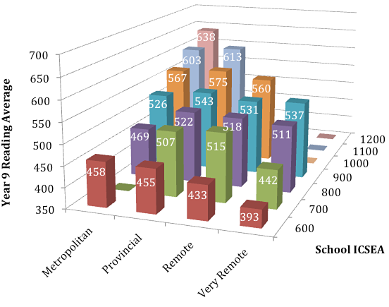
Chart 4. Year 9 Numeracy: weighted averages of school scores
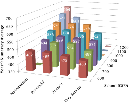
These charts all provide a clear demonstration of the fact that a student’s chances of success are very much influenced by the fortunes of their birth and where they are studying in Australia… and that schools have not, to this point, been able to compensate effectively for the differences.
With that in mind, let’s turn to one last chart, set up on similar lines, showing the money that – as a society and as parents – we spend on educating our young people.
Chart 5. Net Recurrent Income per student (2011)
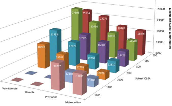
Based on finance data from 2011 published on the My School website, March 2013
For visual clarity, the high-ICSEA metropolitan schools are shown at the front. Of course, dollars are not the only factor in educational success, but most of the programs of change and development in schools that produce success, do cost money: for teacher development, specialist teachers, material resources and so on.
Chart 5 shows that – with one stunning exception – Australia generally does give the greatest dollar amounts to the schools where educational disadvantage is greatest: the low-ICSEA and more remote schools. Whether the amounts are sufficient or not is a moot point. In navigating their terms of reference and the evidence they collected, the Gonski Review took the position that the amounts were not sufficient and recommended a substantial increase in the overall quantum of funding, especially for the most disadvantaged students.
The exception to the overall trend in Chart 5 is evident among the schools in the two highest ICSEA categories, which receive more dollars per student than those in the next lower ICSEA categories. The schools in the 1200 ICSEA category spend on average a similar amount per student to that which is spent on the far less advantaged students in the 700 ICSEA range.
If it seems anomalous that government funding policies should maintain – or indeed contribute to – a situation such as that, then that was also a view of the Gonski panel when it recommended that public funding should go to where it is most needed and should be measured systematically against that need. Under current funding policies, the anomalies are increasing year by year.
For the sake of our nation’s future, we need to set politicking aside and ensure that the Gonski reforms are put in place as soon as possible. Only then might our most disadvantaged students be given the opportunity to reach the educational potential that is presently out of their grasp. •


