HOW MUCH difference did the Howard government make to Australian society? In the heat and hyperbole of political controversy it’s often difficult to get perspective on a government’s achievements and failures – particularly when the credit-and-blame game tends to focus wholly on domestic and party-political factors. A comparative and historical perspective can give a fuller context to the claims and counter-claims. Here we compare Australia’s performance against seventeen other advanced democracies, including the United States, Canada, Japan and the countries of Western Europe.
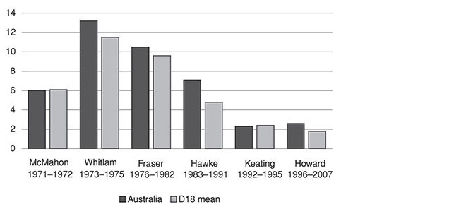
Central to the political credentials of the Howard government was its claim to have been a successful economic manager – a view to which the figures give some, though not unqualified, support. Figure 1 shows that Australia’s per capita economic growth rate moved very broadly in alignment with the average of the eighteen countries. But until Bob Hawke left the prime ministership, Australia had a growth rate rather less than the average; then, under Keating and Howard, it grew more quickly than the average. The highest rates of growth were between 1992 and 2000 – four years under Labor, four under the Coalition – with all countries having a somewhat lower growth rate between 2001 and 2006.
Figure 1: Economic growth
Average per capita growth rates (percentage per annum) during period of each government
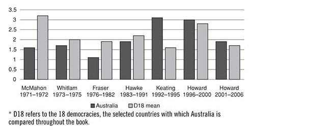
The coming and going of political leaders doesn’t fit neatly with the economy’s tendency to move through cycles of boom and bust. One reason for the Fraser government’s comparatively poor showing in the data is that it bore the brunt of Whitlam’s economic miscalculations. Hawke’s record was rendered unimpressive by the tail-end of Fraser’s recession of the early 80s and by his own recession of the early 90s. Keating and Howard, on the other hand, benefited from the economy’s unusually long expansion phase over the rest of the 90s and into the early 2000s. It is also widely agreed among economists that both leaders benefited from a delayed pay-off from the many economic reforms undertaken by the Hawke government.
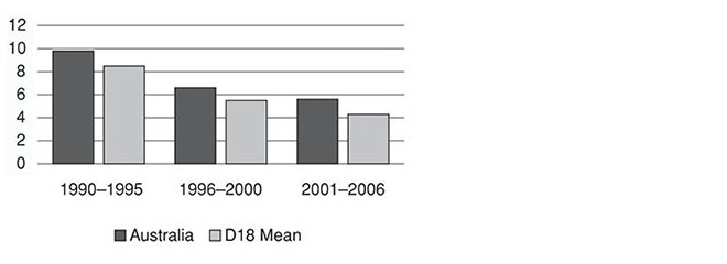
Figure 2 charts a dismal history of progressively worsening unemployment from the mid 1970s to the mid 1990s. Then, in the absence of a recession, the record improved under Howard, at first modestly and then considerably. Australia again tended to move in tandem with the other economies, with some variations: at first, Australia had a lower unemployment rate than the selected countries as a whole, but from Fraser on it was somewhat higher, only falling to less than the average during the very last period under the Howard government.
Figure 2: Unemployment
Average standardised unemployment rates (percentage of labour force) during period of each government
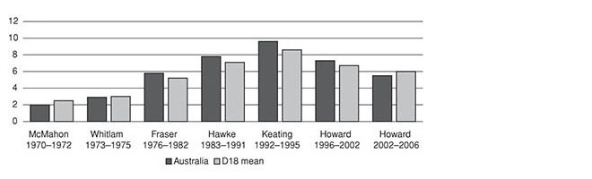
The process of averaging the unemployment rates within each leader’s term flatters Whitlam (the long-term deterioration began towards the end of his watch) and maligns Hawke, who made rapid progress in reducing the 10 per cent unemployment rate inherited from Fraser, but then presided over his own recession, which caused the rate to reach a new cyclical peak of 11 per cent early in Keating’s term. The improvement under Howard was considerably better than in the selected countries as a whole.
It was a proud claim of the Howard government that it had kept interest rates low – at “record lows,” according to one advertisement during the 2004 election campaign. Interest rates move as inflation rises and falls, and figure 3 shows that at the end of the long post-war boom, under Liberal prime minister William McMahon, inflationary pressures were already considerable. Then came a terrible blow-out under Whitlam, only modest improvement under Fraser and Hawke, but a return to low inflation under Keating and Howard. The eighteen-country average exhibits a very similar pattern. The notable exception was Hawke’s term. The return to low inflation began in the 80s for most of the developed economies, but in Australia was delayed until the 90s while Hawke concentrated on using his accord with the union movement to lower real wages and thereby increase employment.
Figure 3: Inflation
Average inflation rates (CPI average change per annum) during period of each government
Since the 1990–91 recession, Australia has returned to low inflation. Australian economists tend to attribute this continuing success to the side-effects of economic reform which, by heightening the degree of competition in the markets for many products, reduced the scope for excessive wage settlements (or “sweetheart deals”) and a flow-on to prices. But this raises the old question: how does this purely domestic argument explain the very low inflation rates in the other developed economies? Inflation under Howard was lower than under any other Australian government except for Keating. But Howard’s term coincided with the selected countries as a whole having their lowest period of inflation since 1970. The Australian rate was still considerably higher than the average, although some domestic factors contributed to this, including the one-off impact of the introduction of the GST and the fall-out from the resources boom.
The same applies to interest rates (figure 4), with Australia moving in the same pattern as the countries as a whole, but always at a higher rate. Indeed, the Australian long-term interest rate was 1.3 points above the average in the five years preceding Howard’s government, and it was also 1.3 points above the average in its last five years. During the Howard years Australia consistently had the second highest interest rates among the selected countries, with only New Zealand having a higher rate.
Figure 4: Long-term interest rates
Average long-term interest rates as a percentage per annum in each period
These figures together provide ample proof that governments are far from being masters of the economic destinies of their nations. Indeed the way trends move in common shows how international influences help to set the economic conditions governments must deal with.
Governments have more direct control over their own taxing and spending. Here, the differences among the selected countries are considerable, but their relative rankings show great constancy over time. Figure 5 shows that a sharply increasing share of national income was devoted to government spending in every decade between the 1960s and 1980s. During the 1990s, that growth stopped, and in the first years of the 2000s it declined. Australia was again substantially below the average of the selected countries, by around 9 percentage points in the first period and a similar amount in the last. The common factor underlying the fall in government outlays was the long economic expansion. Rapidly rising incomes make it easier for the government share to decrease. In addition, many countries, often facing tax revolts among sections of their publics and increasing attention to the effectiveness or lack thereof of government programs, have adopted more stringent attitudes towards public spending.
Figure 5: Government spending
Total government expenditure as a percentage of GDP, average for each period
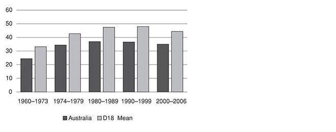
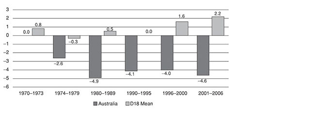
Figure 6 shows general government debt in relation to GDP. Among the years given, it reached its peak in 1995 for both the selected countries and Australia. Australia was always below the average of the selected countries. It never had the very high, potentially disastrous debt levels of Belgium and Italy, where government debt was more than 100 per cent of GDP. But debt was also reduced much more sharply under Howard than in the selected countries as a whole, so that by 2006 it was only around a quarter of the average and the lowest debt percentage among all the selected countries.
Figure 6: Budget surpluses and deficits
Central government net borrowing or lending as percentage of GDP

Other indicators are less propitious. Figure 7 shows that the trend in Australia’s current account deficit is worse than for the selected countries overall. Except for 1974–79, the other countries averaged a surplus on their current account. After 1973, Australia was always in deficit. The largest deficit was in the 1980s, a period in which the Australian dollar fell sharply. The situation improved somewhat in the 1990s. But in the early 2000s, while the current account in the other selected countries continued into a larger surplus, the Australian current account went into a larger deficit. By 2005 it was considerably greater than when Howard came to office. This deterioration is the more remarkable because it occurred when Australia’s terms of trade were the best they had been for a generation. The rising prices of minerals, especially fuelled by growth in demand from China, would normally lead one to expect that Australia’s balance of trade would improve rather than worsen.
Figure 7: Current account balance
Current account balance as percentage of GDP, average for each period
The comparison with the selected countries is misleading, however, in the sense that unlike most of them, Australia has always been a capital importing country. While Australia has had a current account deficit through almost all its history – because of its need to import capital to fund development – this has been paid for in the long term by continuing economic growth.
Another set of balance sheets deteriorated during the Howard years, one whose future economic consequences are also a matter of conjecture. Figure 8 shows that Australian household debt in relation to disposable income has grown considerably over the years. Indeed it almost doubled during the Howard years. Some other countries have even higher levels of household indebtedness, but Australia is considerably above the average.
Figure 8: Household debt
Household debt as percentage of household disposable income
A central reason for increased household indebtedness is the increasing price of housing. Australia experienced one of the sharpest rises in prices, so mortgages in relation to income have grown prodigiously during the Howard years. In fact, home loan interest payments were higher than when housing interest rates peaked at 17 per cent in 1989. The rate of home ownership among those under thirty-five dropped. Again this suggests increased financial stress for many people, despite the relatively good economic growth.
In all these phenomena – trade and current account balances, household indebtedness and house prices – we are dealing with the behaviour of markets, with decisions by individuals and companies, over which the government has limited influence. The Howard government did not directly or deliberately decide to increase the current account deficit or household debt. How should we evaluate its performance and responsibility in these areas?
In 1996 the Liberal opposition was in no doubt that the current account deficit was Labor’s fault. Part of its campaign was to drive a “debt truck” around with big billboards highlighting that Australia owed $193 billion. By the time of Howard’s defeat in 2007 that figure had grown to $544 billion. Similarly, at first the Howard government thought that rising home prices was good news: “I haven’t found anybody stopping me in the streets, shaking their fists and saying John, I’m angry that the value of my house has gone up,” said Howard during the first years of the housing boom, a tone that would change later as housing affordability became a vexed political issue.
While the government’s early attitude was blasé, and while some of its measures, such as cutting capital gains tax, could be said to have exacerbated the problem, the key factors driving the boom in house prices were not the government’s doing. They arose from a combination of unmet demand, increasing aspirations for better houses among those who already owned one, low interest rates and the relatively easy availability of money from lending institutions. Even a government determined to restrain the increasing prices would have had limited capacity to do so.
Under the Howard government there was an increased emphasis on private delivery of what had previously been public services, often with the introduction of a public subsidy delivered by tax rebates, for example. This was very much the case in health, in child care and aged care – with in each case vigorous public debates about the merits and weaknesses of the policy direction. Unfortunately in none of those cases are the international statistics sufficiently penetrating or discriminating to illuminate the discussions.
But in education, the comparative statistics are quite revealing of the divergent policy approaches. The public share of total education spending Australia was already at the low end of the spectrum in 1995 before the Howard government came to power. But it became even more so in the following ten years, making the private share of education spending third highest among the selected countries and the public share 12 points below their average.
Much of this was to do with the growth in private schools, and that points to another of its distinctive features, the public subsidy of private providers. One-fifth of Australian public spending on education goes to private institutions, almost double the overall average of 10.5 per cent, a particularly high figure when it is remembered that private universities have a negligible presence in Australia. Of the sixteen countries on which we have data, only Belgium is higher and that goes back to historical arrangements between church and state in that country.
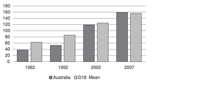
The data on universities is even more dramatic. In 1995 Australia was already at the lower end of the countries in terms of the public share of tertiary education spending, 13 points below the average. After another decade, though, the public share had dropped to less than half, 48 per cent, and Australia was then 26 points below the average.
This reflected an increased emphasis on private funding, but also – uniquely among these developed democracies – a reduction in real terms in public spending on tertiary education. In 2005, Australia spent 0.8 per cent of GDP compared with an average of 1.1 per cent. In other words Australian expenditure would have had to increase by around 35 per cent to bring it up to average. In the other countries for which we have data, public spending on tertiary education was up by 30 per cent in real terms over the decade 1995–2005. Only Australia’s decreased.
How will the Howard government be viewed in ten or twenty years’ time? On several central measures of macroeconomic performance (economic growth, unemployment, productivity) the government scored comparatively well. On some of the achievements trumpeted most loudly at home, such as inflation and interest rates, its performance was actually worse than the average of the selected countries.
As with all governments, the Howard government’s economic management and foreign policy decisions will be central to any assessment. The aging society, health care, the challenges of the information economy and society, and the environment will also be central concerns. In each of these areas, the government is likely to be marked more harshly in the future than it was when in office. •