MY SCHOOL is now two months old. Everyone will remember the excitement at its birth; according to the Australian Curriculum, Assessment and Reporting Authority, or ACARA, millions of people were there at the time, or soon after. The media wrote about little else for a few days, and ponderous commentators called it a win for Julia Gillard and declared that, as an election issue, education was firmly in the bag for Labor. All the language of openness, transparency, choice and quality schooling was loaded up to fire at anyone who stood in the way.
My School is back in the news because of an Australian Education Union moratorium on this year’s NAPLAN tests, which currently provide the essence of what is commonly called school performance. Debate about the accuracy of the website has continued, focusing especially on the value of the Index of Community Socio-Educational Advantage, or ICSEA, which is used to compare schools. To date, ACARA has not responded adequately to questions about the accuracy or fairness of My School. These questions won’t go away.
But while I’ve argued that My School says very little about the effectiveness of any school, it does offer some tantalising information about our school system in general – what kinds of schools we have in this country, who they enrol or don’t enrol, how often their students attend, what resources they have and their relative size (and viability). The NAPLAN tests administered at the beginning of secondary school also give us some idea of which students are enrolling in which types of schools. All this is poor compensation for the flawed comparisons between schools, but it is worth mining the website to see what it can tell us.
Schools are very different….
For years we have relied on information released by the Australian Bureau of Statistics to gauge the broad differences between schools. But ABS data is usually aggregated into no more than three categories: government, Catholic and independent. Australian schools are more complex than that.
At first sight My School doesn’t seem to help – it has just two categories, government and non-government. But the My School list can be used to divide schools into any number of categories. For the purpose of this article I have created five groups of schools. (I have only looked at schools with secondary enrolments, mainly because enrolments become far more differentiated between schools in the secondary years.)
Using My School data I filtered schools by type and name to create the following groups: government (446 schools); mainly systemic Catholic (156); Anglican (64); Christian (194); and high-fee independent (including some Catholic) schools (43). Some of the filtering has been done manually, for example to separate systemic from independent Catholic schools and to extract “Christian Brothers” schools from the “Christian” list, and to eliminate smaller school groups such as Steiner, Lutheran and some others. (To make sure that the sample size for each group is adequate and comparable, some of these groups are Australia-wide and others are confined to one representative state.) Each delineated list has been checked to keep it as accurate as possible.
Some of the information about schools in the “school facts” section of My School is of very limited use. A host of caveats apply to the data about “senior secondary outcomes” and the reader gets the impression that this section has been added to fill up the page. The data on student attendance rates is also less than revealing (did you know that attendance rates in high ICSEA schools exceed those in low ICSEA schools?).
The size of schools is probably worth thinking about because it demonstrates different obligations and decisions made by schools and school systems. It is not surprising that 35 per cent of government schools with secondary enrolments have fewer than 300 students. Government schools are obliged to serve all communities, almost regardless of how small or how remote they may be. Catholic schools operate in many towns but have no such obligation – only 4 per cent had fewer than 300 students. A reasonable number (20 per cent) of high-fee schools are small but a much larger proportion of Christian schools (40 per cent) have fewer than 300 students. Big questions can be asked about the desirability of (publicly supported) choice versus the efficiency of larger-scale provision, but these are beyond the scope of this article.
…and don’t enrol the same students
The more interesting information on My School relates to what we know about the enrolled students in each school. The average ICSEA value for all government schools in Australia is 980 and the average for non-government schools is 1031, but our five sample groups reveal finer differences between schools. After government schools (with an ICSEA of 984) Christian schools have the lowest ICSEA at 1002, with Catholic schools at 1043, Anglican schools at 1054 and the high-fee schools at 1123.
But there are serious problems with ICSEA, described in the section below. At the very least ICSEA values are overstating the socio-economic profile of the enrolments of government schools and understating the profile of private school enrolments, which means that the gap between the two is greater than ICSEA suggests. The 2001 census, for example, shows that while 21 per cent of students in government schools are from families in the highest of three family income bands, that figure is almost double for non-government schools.
Among the limited reliable data about students on My School are the figures on the proportion of Indigenous students in each school’s enrolment. These certainly suggest differences between groups of schools. The enrolment of Indigenous students is periodically in the news – in the frequently promoted programs to enrol Indigenous students in boarding schools, for example, or in the alleged “white flight” of families from schools with high Indigenous enrolments reported a couple of years ago by one major newspaper.
To what extent do our groups of schools serve Indigenous students? If we use the language favoured by the media, the schools that rank at the top of the league table are public schools. Indigenous students make up around 7 per cent of the enrolment of government secondary/central schools in New South Wales, ranging from 3 per cent in metropolitan schools to 11 per cent in provincial schools and much higher again in remotely located schools. Schools entirely located in Indigenous communities are not included in these figures.
Who is next in this league table? Indigenous students make up about 3 per cent of the enrolment of Christian schools across Australia. (Again, this excludes schools – four in this case – established in Indigenous communities.) The average for Catholic schools in New South Wales is lower at 2 per cent, 4 per cent in provincial and 1 per cent in metropolitan schools. The sixty-five Anglican schools in the national group come equal last with the high-fee independent schools in New South Wales; Indigenous students make up around 1 per cent of their enrolment. No Anglican or high-fee schools appear to be located in Indigenous communities.
Some people might respond to this by saying that it is a statement of the obvious. Because government schools don’t charge fees and must serve all areas and communities, Indigenous students are highly likely to be well represented in their intake. And it is true that, among non-government schools, only some Catholic and some Christian schools are located in the more distant provincial areas. At the other end of the scale it is hardly surprising that high fees deter any families with low incomes. But in equivalent areas there are still differences: the Indigenous enrolment in metropolitan Christian schools is 2 per cent, double the rate found in Catholic schools and even higher again than the rate found in metropolitan Anglican schools.
All fee-charging schools, by definition, discriminate in enrolments, but is there anything else at play here other than school fees? To what extent do non-government schools try to enrol Indigenous students? If they succeed, what is the family profile of those who do enrol? National data suggests these students will still come from higher-income families. In the light of all this, what should be the appropriate purpose and use of government funding? After all, Christian schools get lower per capita government funding than do Catholic schools yet seem to enrol more Indigenous students. Should funding of non-government schools take this into account?
Staffing levels
The distribution of the critical resource of teaching and support staff in schools is another area in which the ABS categories of government, Catholic and independent don’t tell the whole story. We have long known that independent schools have the best staff–student ratios, followed by government schools and then Catholic schools. But according to the categories of schools derived for this article there are considerable differences between different types of non-government school. The high-fee schools enrol around 10.4 students for each teacher. Anglican schools are almost as well resourced, with 11.4 students per teacher. Next come government schools with 12.5 students per teacher. Catholic schools trail with 13.5, followed by Christian schools at 14.6 students per teacher. In effect, the best-staffed schools are 40 per cent better off than the worst, and both are categorised as independent schools. The differences among the government, Catholic and independent samples chosen for this article aligns with ABS data on staffing ratios, although the diversity within the independent sector is certainly not indicated by the ABS.
The differences between schools widen considerably when we look at staffing ratios for non-teaching staff. The best-staffed schools are almost three times as well served as the worst. Again it is the high-fee and Anglican schools that have the most non-teaching staff, one for every twenty or twenty-two students respectively. Next are the Christian schools with one non-teaching staff member for every 30.7 students, followed by the Catholic schools with one for every forty-four students. The schools with the lowest ratio of non-teaching staff to students are government schools, where each non-teaching staff member serves 57.2 students.
Put another way, it appears that every non-teacher in a supporting role in high-fee, Anglican and Christian schools has just two teachers to support, while the ratio is over one to three in Catholic schools and over one to four in government schools.
There are explanations for and questions to be asked about such differences. Some systems of schools have support personnel in head or regional offices rather than in schools and this might help to explain why ratios are poorest in government and Catholic schools, where support is more centralised. It could also be argued that a significant number of high-fee schools have more non-teaching staff to support student boarders.
But why are Anglican schools apparently one-third better staffed than Christian schools? Is this related to purpose and priorities or to other factors? Can it be explained by differences in public funding or in funding from private sources, or a combination? Can it be explained by different fee levels or varying levels of fee exemptions? Are Christian and Catholic schools carrying more fee-exempt students than are Anglican and high-fee schools?
And then there are a host of “should” questions. Should combinations of public and private funding be allowed to create such stark differences between schools? Schools may argue that parents have a right to pay whatever level of fees they choose, but what should be the role of government funding of these schools: to worsen the divides or to try to provide better support to the schools which have apparently taken on the hardest tasks?
NAPLAN: displaying the academic divide
While the debate rages on about the capacity of NAPLAN scores to say anything meaningful about the effectiveness of schools, some test scores might give us a more accurate picture of the academic divide between schools. While Year 7 NAPLAN results can’t say much about any school – especially when students in most states have been there for less than four months – they might describe the existing achievement level of students who are enrolling in different types of schools. To find out more let’s go back to our five categories of schools. For this purpose I’ll use Year 7 and Year 9 NAPLAN scaled averages and show how they vary among groups of schools.
Comparison of Year 7/9 scaled NAPLAN averages
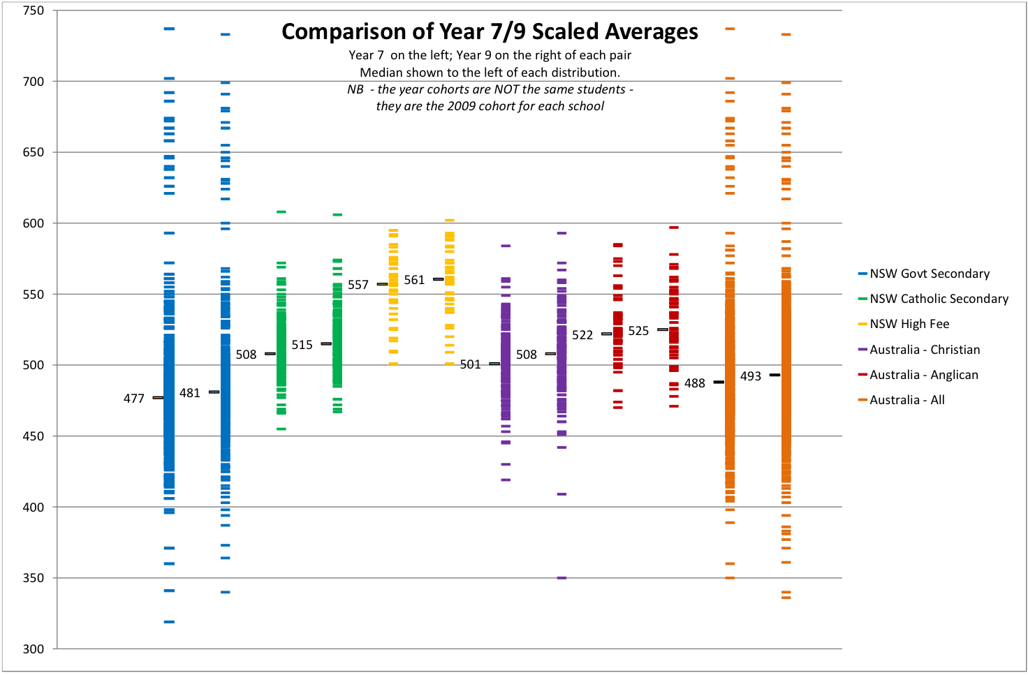
Graph by Bernie Shepherd
Across Australia the scaled median Year 7 NAPLAN score is 488. This indicates the median achievement level, as defined by the rather narrow reach of NAPLAN, of students in Year 7. But as the graph illustrates, government schools are showing median scores below this number, and non-government schools scores above. The median score of students in each of the five categories is as follows (with the score as a percentage of the Australia-wide scaled median of 488 shown in brackets):
Government schools – 477 (97.7 per cent)
Christian schools – 501 (102.6 per cent)
Catholic schools – 508 (104 per cent)
Anglican schools – 522 (106.9 per cent)
High-fee schools – 557 (114.1 per cent)
Some might claim that these differences represent the greater or lesser effectiveness of schools, rather than the students enrolled. One way to test this might be to show how the ICSEA values of the above groups of schools vary from the ICSEA median of 1000:
Government schools – 984
Christian schools – 1002
Catholic schools – 1043
Anglican schools – 1054
High-fee schools – 1123
In the absence of information about all the other factors that bear on school performance – and the considerable shortcomings of ICSEA – it would be unwise to attribute any apparently higher or lower NAPLAN scores to school or system effectiveness.
Other measures of apparent school effectiveness need to be treated with similar caution. The Year 7 and Year 9 scaled NAPLAN scores on the above graph show some differences among the groups of schools. The Year 9 median scores (for a different cohort of students) are higher in each case but the relative rank of each sector remains unchanged. We don’t know what creates the minor differences, so it would be rather foolhardy to shout from the rooftops that (for example) Catholic schools improve student performance far more than do Anglican schools.
A story we already know
There are two stories coming out of My School. The first includes the initial hype followed by the spurious comparisons, encouraged by ACARA and taken up with great enthusiasm by the media and others. This continues a grand tradition in this country of government and public infatuation with unproven and populist school reform, leaving deep-seated problems languishing in the too-hard basket.
The second story, or set of stories, will take longer to attract attention. They’ll require more focus and probably raise as many questions as answers. These are the stories about the more enduring differences among our schools and how these differences contribute to what is arguably a dysfunctional school framework, created by decades of ad hoc policies. The stories will increasingly tell how we’ll never sustain high educational standards in this country, and reap the social and economic benefits, unless we make serious efforts to reduce the very distinct and depressing social and academic gaps among schools, a product of geography and quasi-market ideology interspersed with official neglect.
In the end we’ll realise that the more intractable problems faced by our schools, and a big part of the solution, lie outside the school gate – and that My School says as much about the effectiveness of education policy as it does about schools. We’ll eventually realise that Julia Gillard’s exhortation that we “rouse on” so-called underperforming schools is an excellent tactic – but one that should be turned back on governments in the form of demands for a real education revolution. •
MY SCHOOL AND ICSEA
Week by week more problems emerge over the use of ICSEA, the Index of Community Socio-Educational Advantage, as a device to categorise and enable the comparison of schools. ICSEA is a proxy measure created by using census collection district, or CCD, data. In this proxy form it does not accurately describe the characteristics of any given family, nor does it accurately describe the enrolment of any particular school. In fact, the ABS clearly warns against attributing average CCD data in this way.
The census does tell us more about the family profile of children in each CCD who attend government and non-government schools, and it certainly challenges the averages used by ACARA. In a 2004 study of the Penrith Statistical Local Area Barbara Preston revealed that, if it drew from just the ten most disadvantaged CCDs, a public school would have sixteen disadvantaged (low family income) students for every one advantaged (high family income) student, while an independent school drawing only from the same CCDs would have equal numbers of disadvantaged and advantaged students.
Clearly the families in any neighbourhood are not the same, and their children are often divided off into very different schools. These schools cannot be accurately described, as they are by ICSEA values on the My School website, in terms of CCD averages. Schools with the same or even similar ICSEA values may not be similar at all.
ACARA knows there is a problem with ICSEA because, as the NSW Secondary Principals’ Council discovered, they have manually changed the ICSEA values for some schools for which they have specific school (rather than CCD) data. What about the rest?
Yet ACARA still says that “Fair and meaningful comparisons have been made possible by making use of ICSEA.” This is a false representation of what ICSEA shows and consequently My School does not fulfill the stated expectations or descriptions contained in the site.
The uneven distribution of students even within CCDs between government and non-government schools has implications for ICSEA values attributed to schools across Australia. Low-income families are disproportionately represented in public schools and high-income families in private schools even more than ICSEA suggests. The gap between the public and private school average ICSEAs is greater than between 980 and 1031. The social divides between schools are being seriously understated. •
— Chris Bonnor