Just My Type: A Book about Fonts
By Simon Garfield | Profile Books | $29.99
THE FONT GAME, which first appeared at I Love Typography and is also available as an iPhone app, invites players to identify thirty different fonts from alternatives that are generated out of a database of “657 gorgeous samples.” Success is based on both accuracy and speed and there are three levels of difficulty – Somewhat, Rather and Exceedingly. The best score “for all time” (meaning for all time so far) belongs to Theon of Guyana who has picked all thirty correctly in an impressive thirty-nine seconds, closely followed by Timi of Hobart who took only slightly longer, at forty-five seconds, to achieve perfect accuracy. There are other players who are not far behind, followed by many more who are moving up the ranks and gradually improving their recognition rate and hence their scores.
It is very much a game for the times, a product of our newly acquired awareness of the significance of fonts – of the appearance of the text we read, and the impact of that appearance on our lives. It is hard to imagine the Font Game gaining traction twenty or even ten years ago. Outside of a small number of professionals and aficionados, there simply weren’t enough people with enough familiarity with the world of fonts – people who habitually read the medium as well as the message – to make up a viable pool of players. It was very much a specialist interest. That has all changed; not only did the web enable the Font Game in terms of providing the technological platform, it did so too by creating a large cohort of enthusiastic followers of fonts.
As Simon Garfield points out in his clever and funny book on the history of typography, Just My Type, “the word ‘font’ – previously a piece of technical language limited to the design and printing trade” is now very much part of “the vocabulary of every computer user.” As it has become part of everyday speech, it has also lost some of its precision. Once used to describe a subset of a more comprehensive typeface – the letters as they appear in upper case, for example, or italicised – it is now generally used interchangeably with “typeface” itself, to mean an entire family of type. This does not make it any easier to pin down exactly how many there are, though Garfield estimates there are now “more than 100,000 fonts in the world.”
In any event we are probably already past counting, particularly when the full range of variations and modifications – not to mention adaptations, updatings, homages and the like – of individual typefaces is included in the mix, and when families of type can extend across languages and scripts, hoovering up letters and characters and an infinity of quirky, language-specific marks, creating vast compendiums of the raw materials of printed text. To say that we are spoiled for choice is putting it mildly. Early on in Just My Type, Garfield in effect asks the question that has occurred to most of us as we’ve scrolled through the drop-down menu trying to decide which font to use. Why do we need so many?
It’s a question that Garfield returns to, offering various possible answers without quite settling on a definitive one, perhaps because there is no real point in finding a definitive answer. Whether or not we need all these fonts, we’ve got them and we are getting more every day. The unused and unloved ones will retreat further and further into the background, but they can’t be uninvented, so the question becomes one of understanding why some fonts work better than others, why some are more suited to specific purposes and why – the most difficult question of all – some just look better and can stand infinite repetition. Still, the fact that the font revolution is unstoppable doesn’t mean that people don’t wish that somehow it could be stopped.
Garfield quotes Erik Spiekermann, co-founder of FontShop and “a legend in the graphic design world,” as he comments with more than a hint of exasperation that nowadays “everybody wants to design a bloody typeface.” In similar vein, the distinguished designer Massimo Vignelli caused something of a stir earlier this year when he cheekily proposed in an interview that the list of available fonts could and should be whittled down to twelve (“I am being generous today”), which would in his view be to the benefit of all. It wasn’t only type designers, in forums and on sites like I Love Typography, who objected to this view. For the large and growing community of people who just love fonts and typefaces, the over-abundance of design choice is part of the attraction, just as it is for people who love wallpaper or designer chairs.
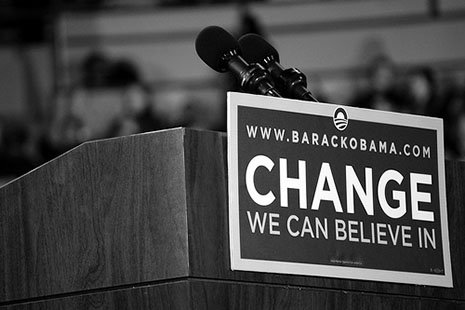
And there is always the chance, if you keep your eyes open, of spotting the next Albertus (1932, by Bethold Wolpe), a favourite of Simon Garfield’s, which he calls “the most expressive font in town,” or Helvetica (originally 1957, by Max Miedinger and Eduard Hoffmann), whose ubiquity in the modern world was the subject of Gary Hustwit’s successful 2007 film of that name, or Gotham (2000, by Tobias Frere-Jones), the Obama campaign typeface, credited by many observers with managing “to look both establishment and fresh,” and thereby with helping to get the candidate over the line and into the White House.
Another attempt to answer the question – the question of why we need “so many blasted typefaces,” as one frustrated contributor to a Microsoft forum puts it – is offered by Adrian Frutiger, creator of the classic Swiss typeface Univers (first designed in 1954). Garfield quotes Frutiger as likening the diversity of typefaces to the diversity of wine. When there are so many versions, “it’s the nuances that are important.” For the type designer as for the winemaker, originality and difference must be contained within strict parameters, as set by historical conventions and by the expectations of readers (or drinkers), and these can be pushed only so far before what is produced is no longer recognisable as text or wine.
Given the subtlety of the differences between them, expressing just what it is that makes one font superior to another, or indeed one wine to another, in anything other than highly technical language is a challenging task, with the results – a lexicon of adjectives like “assertive” and “crisp” that seem never quite to capture what it is we are getting at – left all too open to dispute. In the end, says Garfield, the “only intractable, invincible basic rules of good type” are that it be “interesting” and “beautiful,” and “tasteful and witty and apt. And readable.”
Without at all labouring the point, Garfield makes it clear that this last, ineffable quality, of readability, is the key to any successful typeface. But therein lies a paradox. A good typeface should be a pleasure to look at in itself without distracting from or obscuring the meaning contained in the words. To that end, it must have a timeless quality and yet speak to the times; a dated typeface, however aesthetically pleasing it may be, can be a barrier to meaning. Garfield captures the simple eloquence of the great designers in both articulating and celebrating these apparent contradictions. The individual letter should be “both banal and beautiful,” says Frutiger. “The excellence of a designer’s work,” wrote the creator of Goudy Old Style, Frederic Goudy, in 1940, “depends entirely upon the degree of imagination and feeling he can include in his rendition of… traditional form.”
The adaptation of traditional typefaces for the computer age continues to have a huge impact, by fuelling the rise of font literacy and the proliferation of choice. It has led, too, to a more widespread understanding of how, with the right font and layout, the written word can be made to appear to its best advantage. In his essay of 1915 on “Modern Typography,” Bernard Shaw declared his view that “an author is not a fair judge of a printer, because the author himself usually spoils the printer’s work.” By this he meant that in correcting proofs of their own work, authors would blithely fiddle about, adding and deleting bits without regard for the look of the words on the page, “so that the printer finds all his trouble wasted and his work disfigured.” Shaw identifies an exception to this rule in William Morris, a writer and printer both, who “whenever he found a line that justified awkwardly, he altered the wording solely for the sake of making it look well in print.” This is now something we can all do; with a few keystrokes, we can change the look to suit the words, and with a few more, we can if we wish change the words to suit the look.
All creative endeavours, however radical, operate within certain formal constraints, but few can be as hemmed in as font design. Yet inventiveness thrives within this rigid framework. Wit and originality can be expressed in something as small as an unconventional tittle (the dot on the “i” or the “j”) or in the contrast between the size of the two bowls in a looptail “g.” Postmodernism, with its emphasis on questioning and upending the conventions, has never really gotten a grip on fonts, despite the development of categories of typefaces like “grunge” and “abstract.” If a newly created typeface is to have some expectation of being widely used it cannot stray too far from the principles of mid-century modernism, of clarity and functionality.
Font design remains at heart a bastion of seriousness, even as irony and irreverence have become the default registers in so many other aspects of contemporary life. So-called “ironic fonts,” the ones that call attention to their own font-ness, can be fun and on certain occasions can feel just right, but they rarely take off, their application confined to specialised websites or to small, one-off ad campaigns. The same can be said for “calligraphy” and “handwriting” and “handwritten” fonts, examples of which will achieve sudden popularity only to disappear just as quickly.
And if a fun or naturalistic or faux-naif font does cross over into genuine popularity and doesn’t have the grace to fade away of its own accord, the wrath of the font community can be something to behold. Garfield begins Just My Type with the story of the friendly and casual-seeming Comic Sans (1994, by Vincent Connare), which was included as a supplementary typeface in Windows 95 and just exploded, to the point where it started showing up in places where a moment’s reflection might have led to another choice: “on the sides of ambulances, on online porn sites, on the backs of the shirts worn by the Portuguese national basketball team.” The backlash – “ban Comic Sans” – has become a phenomenon in itself, accompanied, as so often in cases of bloggers’ revenge, by language of an intemperateness that can seem out of all proportion to the error of succumbing to Comic Sans in the first place.
Garfield identifies yet another paradox in the paradoxical world of fonts. On the one hand it is a place of unfettered freedom, literally so in that many fonts are available free or packaged into other transactions, and even when a direct charge is made it is typically not, given the creative effort that has gone into the design, especially high. For someone looking for the ideal font for self-expression, the range of choice is seemingly infinite. At the same time, the phenomenon of corporate fonts, of commissioning and copyrighting a font that then belongs to the commissioning organisation, is becoming more and more common.
And as anyone who has ever had to conform to a branding strategy will know, once an organisation settles on a typeface – whether it’s free or bought off the shelf or specially commissioned, the world of fonts can suddenly narrow down to a rigid and mind-bogglingly detailed set of rules and regulations. Fortunately Just My Type, with its lightly worn historical and technical references, its portraits of the (often unsung) heroes and heroines of font design, and its break-out chapters on some of the fonts that have made design history, avoids this kind of prescriptiveness in favour of celebrating the vast and ever-increasing multitude of fonts. •