When My School first appeared early last year Chris Bonnor showed how its method of comparing schools was seriously flawed. My School 2.0 promised to do better, but how good is it?
This is the first of three articles. The second will outline what the new My School website says about Australia’s schools. The third looks at the broader question of what makes a good school.
AFTER MANY FALSE STARTS the My School 2.0 website finally hit cyberspace on Friday 4 March 2011. It sparked substantial coverage and debate around funding and the resource gaps created in our hybrid framework of schools. In all this initial excitement we seem to have forgotten, for the moment, that the core of My School is the way it is supposed to enable comparisons between schools. The claims made about My School’s capacity to do this must not escape serious scrutiny.
The unveiling of the first version of My School in January last year created great interest, a few league tables of schools and many views about different schools. It was launched with all the language of transparency, accountability, choice and quality – almost a perfect storm of political advantage. And it was accompanied by more than a few misleading claims from its architects and its sponsors within the government about its accuracy, the information it contained and the relative merits of schools, which we were encouraged to compare.
For a time My School also united most sectors involved in school education. Teachers, unions and principals’ peak groups, professional associations and academics all condemned the inaccuracies in the site and the distortions that would be created by the over-reliance on NAPLAN test scores as an indicator of school effectiveness. There was considerable concern over the misuse of NAPLAN to create school league tables.
This concern came to a head last April when the Australian Education Union placed a moratorium on the tests, although most of its newfound allies stepped aside when push came to industrial shove. The dispute was resolved with an unabashed Julia Gillard – then deputy prime minister – declaring victory over the union while promising to set up a working party to address many of its concerns and those of the wider teaching profession.
My School and NAPLAN have now been under considerable scrutiny for over a year. The Australian Curriculum, Assessment and Reporting Authority, or ACARA, has learned more about consultation and its working party considered a number of ways to improve the site. Numerous articles and seminars have unpacked the website’s claims to accuracy and fairness, with particular attention paid to the Index of Community Socio-Educational Advantage, or ICSEA, created so we can compare “similar schools.” Last November the Senate handed down the report of its inquiry into the administration and reporting of NAPLAN testing.
With some exceptions the mainstream media didn’t say much about the unresolved problems with My School 1.0; arguably, they had achieved what they had campaigned for: finally they could create league tables of schools. This was a win; time to move on.
But the pressure to improve the website has certainly driven big changes in My School 2.0. While these changes have improved the site, they also illustrate the extent to which the much-vaunted My School 1.0 was flawed, and how various claims about its accuracy and utility even bordered on the fraudulent.
It is worth examining the changes that have been made to My School, for three reasons. First, a large number of schools were named and shamed during 2010; their reputations were adversely affected or boosted by comparisons that we now know were inaccurate. Those schools that had their reputations trashed are entitled to some statement of contrition from the government and from ACARA.
The second reason is even more important: notwithstanding the claimed improvements in My School 2.0, it remains inadequate – yet it still encourages parents and the community to make flawed and potentially damaging judgements about schools.
The third reason is that, all its problems notwithstanding, the My School website will tell Australians more about our system of schools than they have ever known before. While it still says little about individual school quality it is pointing to serious social and other divisions between schools and displaying the case for rethinking how we provide and fund schools. This is happening at the very same time that the government’s Review of Funding for Schooling is raising related issues. Hence it is critical that My School be regarded as accurate, measured and credible. As we shall see, it still has a way to go.
The more things change…
Most of the significant changes to My School 2.0 are well known. Conditions for the use of data are now established, although some media outlets were still able to create and publish data tables within twenty-four hours. For local groups of schools such tables, created from a narrow band of test scores, can still be created in a few dozen mouse clicks.
Schools can now provide more information and commentary on the School Profile page. This page also includes additional summary information on finances, post-school destinations and the proportion of students with a language background other than English – along with other data of variable usefulness. Possibly the biggest change is the addition of new (and evolving) data on school finances.
The presentation of NAPLAN scores has been improved, mainly by showing a reasonable margin of error for each figure – something that hasn’t tempered use of the data to compare schools. The inclusion of a measure of “student gain” – showing changes in test scores over two years – is new, although there will be various interpretations of what it shows. What can be safely predicted is that test scores will generally improve in the first few years as teachers get better at teaching to the test. Then we should brace ourselves, when the growth line inevitably flattens out, for the next moral panic about standards. It’s happened in our two pin-up jurisdictions – New York (see here, here and here) and Britain (see here and here) – so why not here?
The “gain” data might hold up to some extent. After all, the test scores of students who are new to a school aren’t included in the growth calculation. Oddly, they still contribute to other displayed NAPLAN scores – and still affect the reputation of a school – regardless of how long the students have attended their new school. ACARA still hasn’t explained why a high school should get the credit or blame for Year 7 NAPLAN scores when students have only been at the school (in most states) for three months.
There are new tools that show how each school performs against “schools with similar students,” which ACARA also refers to as “similar schools.” They may or may not be the former, but they certainly aren’t sufficiently the latter. While “similar schools” seems to have been chosen for brevity, the effect is misleading: it may not bother the government or ACARA but it reinforces the misleading assumption that differences between schools, after taking ICSEA into account, are solely due to the school.
… the more they stay the same
Many recommendations to improve My School 2.0 have not been implemented. Presumably too many changes would amount to even more acknowledgement that My School 1.0 was seriously flawed. Hence My School 2.0 retains many features that remain familiar, and in many cases, still problematic.
NAPLAN lives on as the core element of the school comparisons, despite the mountain of comment and evidence warning of the consequences of using such a narrow spotlight as a measure of school achievement. Spotlights have a habit of highlighting some things while leaving everything else in the dark.
The colour coding of NAPLAN comparisons remains, despite working party recommendations that it be dropped (though users can now override the default colours and select their own). Shades of red (don’t go there) warn if a school is below the average or below “similar schools.” Splashes of reassuring green (safe to go) apply to those schools that are nicely positioned above others. As we’ll see later, many schools have gone from red to green or the reverse – and it has almost nothing to do with changes inside the schools.
The inclusion of margin of error on the graphs doesn’t really change the website. There is little explanation of the significance of margin of error and ACARA is unlikely to confess that such margins can make the school results, and subsequent comparisons between schools, unreliable and misleading.
Despite the chorus of political and bureaucratic rejection of league tables, My School 2.0 continues to provide mini league tables in the form of easy-to-create comparisons. The creation of local hierarchies of schools is readily supported by information, all on one page, about the percentages of Indigenous students and students with a language background other than English, attendance rates, school income and much more. Even the ICSEA information reminds us that the average ICSEA number is 1000, so how far above or below is your school? My School doesn’t say much about school quality but it certainly provides ample information about our social hierarchies of schools.
The Index of Community Socio-Educational Advantage, or ICSEA
It is hard to forget the hyperbole and controversy surrounding ICSEA, which ACARA incorrectly claimed to be a measure of the “the socio-educational background of the students that attend particular schools,” and Julia Gillard declared to be a “valid, robust measure.” When unveiling the features of My School 2.0 last November, Gillard claimed, apparently without flinching, that the new website includes “a more accurate method” of calculating ICSEA, “which ensures that you can compare schools.”
ICSEA has certainly been revised. In most cases it better describes the family characteristics of students actually enrolled in schools, rather than the general characteristics of people living in the census collection districts where the students also happen to live. This more direct data is provided by most parents when a student enrols at school.
The idea of ICSEA is important. We need to know about the profile of each school’s enrolment if we are to make judgements about how much student learning is solely due to the school. The immediate problem is that home and family data about students is not consistently provided – hence it contributes unevenly to each school’s ICSEA. In cases where the direct data is not sufficient the proxy (census) data is still used. ICSEA is still a blunt instrument.
The second problem is that using the direct data only creates a small (around 7 per cent) improvement in the explanatory power of ICSEA – the capacity of ICSEA to explain the portion of student achievement not attributable to the school. By any standards this is most underwhelming.
The use of more direct data about parents follows advice issued by the Australian Bureau of Statistics. It also takes into account findings from researchers, including Barbara Preston, who demonstrated that the proxy data used in My School 1.0 overstated the socio-educational status of government school enrolments and understated it for private schools. In other words, it was incorrectly showing that government schools were enrolling more advantaged students – and private schools enrolling more disadvantaged students – than was actually the case.
The use of more direct data has meant that some schools (mainly public schools) have seen their ICSEA values fall for My School 2.0, and others (mainly private schools) have seen their values rise (see below). When the penny dropped that this might happen the non-government sector objected to what were described as wild and inexplicable swings, with one spokesperson apparently believing it is all a conspiracy against Independent schools.
Finance
The other significant change to My School 2.0 is that each school’s income comes under the microscope for the first time. Given ACARA’s track record, it may be some time before My School gets this sufficiently correct – although it is, in fairness, a most complex task to gather and post this data. The deficiencies in the finance data, particularly the data provided by certain schools, were what led to the postponement of My School 2.0’s launch. The posting of this data has certainly sparked interest and conflicting claims about what it shows – and a claim from the federal opposition that it is all part of a conspiracy.
A few glitches in the finance data may not bother ACARA: its CEO Dr Peter Hill is on record as being quite sanguine about posting imperfect data on My School 1.0, telling the Senate inquiry that the very publication of the data led to improvements in its quality. He wasn’t asked about any damage the flawed data (used to enable school comparisons) might have done, and might continue to do, to schools during the long process of improvement.
This “ends justifies the means” approach won’t be well received by schools. In the case of government schools, fees, charges and parent contributions include amounts paid for school excursions or held in trust. It certainly isn’t discretionary income available to the school. The income shown for non-government schools doesn’t include anything from trusts, foundations, or share and property portfolios. Clearly the gathering and publishing of finance data about schools has a long way to go before apples can be confidently compared with apples.
In the meantime the bigger problem is that the continuing debate over finance means that deficiencies in ICSEA and ongoing flawed comparisons of schools might again slip below the media radar.
Our “ICSEA 1000” schools – where are they now?
Some might argue that we should forget about the serious mistakes in My School 1.0 and simply celebrate the improvements in the new website. But to pass over these mistakes is to risk falling into the same traps, as we absorb – and the media willingly recycles – the claims made about the new site. It is timely to recall and document the big mistakes made in the very recent past: it might trigger suitable caution as we digest the claims made by and about My School 2.0.
My School 2.0 already tells a sorry story about its predecessor. To see how bad it was we need only see the extent to which the ICSEA values of schools have changed for My School 2.0.
In My School and Your School, published in Inside Story in February 2009, I looked closely at the thirty-five schools with secondary enrolments that were given an ICSEA value of 1000 – the middle of the ICSEA range. It wasn’t difficult to show that these schools did not enrol sufficiently similar students, and that their test scores and the schools themselves could not be safely compared. From day one ACARA’s claim that “ICSEA enables student results on national tests to be understood and compared in a fair and meaningful way” looked decidedly extravagant.
Nothing illustrates this better than the list below showing the same thirty-five “ICSEA 1000” schools, ranked in order of their new and improved (but still far from perfect) ICSEA values in My School 2.0. Far from having the same ICSEA they are now dispersed across a range from 941 to 1059. The fact that all these schools have a different, in some cases very different, ICSEA contradicts a claim made by ACARA to the Senate inquiry:
In a small proportion of cases, ICSEA may provide an inappropriate measure of the socio-educational level of the school. This can occur in instances where there is a mismatch between students’ actual levels of socio-educational advantage and that of the CCD [census] values associated with their addresses.
The “mismatch” described by ACARA applied not to a “proportion” but to all of the original ICSEA 1000 sample of schools. By any reckoning, 100 per cent is not a “small proportion.” My School 2.0 shows that there aren’t too many schools in Australia displaying their original ICSEA value.
The direction, up or down, of the ICSEA values for our thirty-five “ICSEA 1000” schools tells another story that will be replicated across Australia. Fourteen of the original thirty-five schools are non-government schools and most of these fourteen schools have seen their ICSEA values rise – all but four show ICSEA values above 1000. On the other hand, of the twenty-one government schools in the group, seventeen have had their ICSEA values revised downwards.
Some of the extremes and exceptions are interesting. Three of the non-government schools rose by more than forty points. Orange Christian School rose by almost sixty. By contrast, East Preston Islamic College – another non-government school – fell to 962; the information provided by this school on the My School site alone should have suggested to ACARA that it was badly misplaced at ICSEA 1000.
Among government schools the biggest adjustment downwards was for Everton Park State High School, down to 942. Most others ended up in the 950 to 985 range.
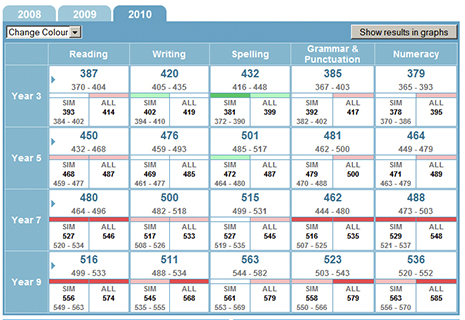
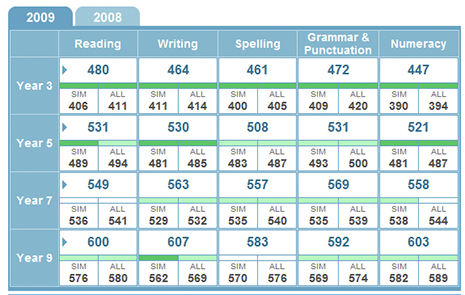
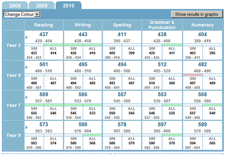
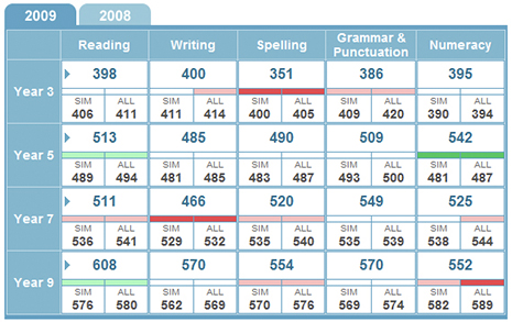
The problems with the comparisons encouraged by My School 1.0 – and the injustice done to so many schools – can be illustrated by displaying some of the “old” and “new” NAPLAN comparisons with so-called similar schools. The first table in each pair was published on the original website, the second comes from My School 2.0. In these tables the green shading shows that the selected school’s results are above other schools’ results to a greater (dark green) or lesser (light green) extent. Shades of red – dark and light again – show that it is below other schools.
East Preston Islamic College

When compared with “similar schools” (“SIM”) and all schools (“ALL”) the NAPLAN results for East Preston Islamic College showed a sea of red in My School 1.0 – this Independent school in Melbourne apparently underperformed similar schools in just about everything. If we use the language encouraged by My School the whole staff at this school should have been spread far and wide to, in ACARA’s words, “learn from other schools with statistically similar populations.” If not, surely the school should have been besieged by parents, encouraged by the then deputy prime minister to “rouse” at the principal and staff. But My School 2.0, the second table, tells a very different story. Its lower and more accurate ICSEA placed the school in more suitable company - it now shows a very different face to the world.
Trinity College South
 This Adelaide Independent school fared very differently in My School 2.0. In My School 1.0 it was incorrectly ranked above or well above “statistically similar schools” on most measures. Its potentially inflated reputation came to a sudden end when My School 2.0 was eventually published. Other ICSEA 1000 schools which are now shown in a less favourable light on My School 2.0 include All Saints Catholic Boys’ and Girls’ Colleges and St Patrick’s College.
Nimbin Central School
 According to My School 1.0 this little central school in northern New South Wales was below or substantially below similar schools in seven areas. In My School 2.0 this reduced to just two. Not only that, it is now above or substantially above similar schools in eight areas, up from three. Despite all its language of authority, My School 1.0 simply misrepresented the achievements of students at this school. Other ICSEA 1000 schools that are now shown in a better light on My School 2.0 include Clifton and Everton Park State High Schools, Wodonga Middle Years College and Woolgoolga High School.
The ICSEA roller coaster
The schools in our original “ICSEA 1000” group represent government, Catholic and Independent sectors. This analysis shows that, regardless of sector, the schools that enrol students from lower socio-educational status backgrounds were the most unfairly treated when ACARA bundled schools together for the purpose of “fair” comparison. Perhaps with the adjustment of ICSEA for My School 2.0 these schools may be able to salvage their reputations. Conversely a number of schools gained an unfair advantage out of previous comparisons and are now less favourably compared with others.
However, the burden of being unfairly compared has not fallen equally on all sectors. In an earlier article I reported on how ICSEA values varied among secondary government, Catholic, high-fee, Anglican and Christian schools. When ICSEA values were revised for My School 2.0 using more direct data from parents the impact was very different, for each sector.
An interim analysis (more details to come in the next article in this series) shows that, on average, only government secondary schools showed a fall in their average ICSEA value. The average fall was in the range of twelve to twenty points. Catholic secondary schools showed little average movement in their ICSEA, with some schools going up and others down. The high-fee schools, Christian schools and Anglican schools all emerged from My School 2.0 with higher ICSEA values
It isn’t surprising to see Christian and Anglican schools face increases in their ICSEA values. These relatively new second-tier Independent schools have been established in communities of middle and low average socio-educational status. Spokespeople for these schools have invested considerable energy in explaining how they enrol a wide range of students, but My School 2.0 shows that their enrolment is certainly not, on average, representative of the demographic profile of these communities. The schools disproportionately enrol an already advantaged clientele.
Our “ICSEA 1000” schools – which schools do they now apparently resemble?
All of these thirty-five schools were supposed to be enrolling similar students. So do they now have more in common with their new ICSEA bedfellows than with their old?
A good starting point might be to consider the gender balance in their enrolments. Leaving aside all the arguments about boys’ and girls’ education it is an inescapable fact that educational performance at school has been found to vary according to the sex of the student. The gender balance can be, yet isn’t, taken into account. In the meantime My School claims that the 606 boys at All Saints Boys, Liverpool can be safely compared with the 830 girls at Nagle College in Blacktown South. The 578 girls at All Saints Girls in Liverpool apparently have a similar socio-educational profile as the 74 girls and boys at Olivet Christian College (K-9) in central Victoria.
The turnover of enrolments is still not considered important. Marsden High School with its new ICSEA of 1027 now has a new ICSEA companion in St Philip’s Christian College in Gosford. Apart from the other unique features of Marsden High School – its enrolment includes many more boys than girls – one third of the students who sat for the Year 9 NAPLAN tests in 2009 had only been at the school for twelve months. St Philip’s has a nice balance of boys and girls but perhaps it also has a massive churn in enrolments? We don’t know and ACARA doesn’t think it matters: the NAPLAN scores are neatly attributed to the school, regardless of how long the students have been enrolled.
ACARA also apparently believes that the new ICSEA can take into account the smorgasbord of enrolment discriminators available to some schools and not to others. Perhaps Marsden High, a free comprehensive public school, really does enrol the same demographic as St Philip’s where annual fees are $6000 – and where you have to divulge details about yourself even to view a copy of the enrolment form. Clearly it takes a significant leap of faith to believe that the two schools enrol a similar demographic.
Is this as good as it gets?
The problems that arise when schools are compared in this way still persist. ACARA is placing far too much credence on the explanatory power (explaining the portion of school achievement not due to the school) of its new ICSEA. While the measure has improved, 30 per cent of a school’s achievement is still owing to factors other than the measurable socio-educational status of its enrolment.
The politicians and ACARA chiefs variously claim that this difference, referred to as the “residual,” is due to the work done or not done by the school. Some of it is, but we don’t know how much – it could be as low as 14 per cent. ACARA doesn’t know. It hasn’t done enough – or hasn’t been given the time to do enough – to account for the whole range of impacts on school achievement.
As indicated in our sample of schools, such impacts include the mix of boys and girls in any school’s enrolment. NAPLAN data shows a measurable difference in the achievement levels of all-boys’ and all-girls’ schools. Even if some of this is created by the single-sex environment, the Australian Council for Educational Research has pointed to a significant difference between boys and girls.
A bigger and unresolved problem with comparing schools is created when some schools select students by test, or previous academic record. We can’t be confident that the educational background of parents, now generally factored into ICSEA, is a sufficient measure of the ability of their children. As the next article in this series will show, the ICSEA of selective schools is similar to the ICSEA of high-fee private schools – but both the Year 7 and Year 9 reading scores of the selective schools are much higher. Perhaps ICSEA does not take student prior learning and ability sufficiently into account?
This problem is not confined to schools that overtly select students by set tests. Any school that has discriminators in place – tests, fees, interviews, records of prior student performance – practises selection to some extent. Between one-third and one-half of secondary schools in Australia include some degree of selection in their enrolment practices.
There are other unresolved but related problems. Does ACARA believe that the shuffling of students from school to school, in an effort to enrol the more desirable and avoid the others, is adequately reflected in ICSEA? Should the NAPLAN scores of students new to a school be attributed to that school? As indicated earlier, ACARA adopts an inconsistent approach to this issue.
Even bigger problems arise out of the construction of the improved ICSEA for My School 2.0. For a number of reasons, including the size of schools, ACARA uses both direct and indirect data to create the ICSEA values for My School 2.0.
Even if this is statistically valid a bigger problem arises over the quality and consistency of the direct data supplied by parents to each school. As Trevor Cobbold from Save Our Schools has pointed out, the COAG Reform Council has stated that this data is inadequate and not robust because many parents refuse to disclose information about their education and occupation: “low levels of disclosure of personal data such as parent education attainment and parent occupation need to be greatly increased for this to be a viable approach across the performance reporting framework.”
The data disclosure rate appears to be lowest among parents with a lower socio-educational status. The problem then arises of a subsequent bias against schools with more students with a lower socio-educational status – because their ICSEA value will be constructed out of available responses and, as a consequence, become inflated. In effect this means that the inherent bias in the proxy data used for My School 1.0 is replaced by a similar bias arising out of incomplete direct data used for My School 2.0. For schools that enrol significant numbers of students with lower socio-educational status this means “heads you lose, tails you don’t win.”
What next? Why are we doing this?
There is little doubt that My School 1.0 was poorly conceived, hastily constructed and rushed off the assembly line at least one or two years before it was anywhere near ready. Any commercial product in such instant disrepair would be subject to a recall or just laughed off the market, with its manufacturer called to account and/or paying a considerable price.
In the case of My School the media cheers have drowned out this particular accountability and the price was paid, not by the federal government or ACARA, but by those schools that were falsely compared. Those responsible for this product (the politicians) and those responsible for its design and assembly (ACARA) have managed to escape relatively unscathed.
While most public schools in particular are entitled to look back on My School 1.0 with anger they can still only look forward with mixed feelings. ACARA has worked hard to improve ICSEA, but My School 2.0 has not identified schools that are sufficiently similar to enable safe and definitive comparisons. The website still doesn’t achieve what ACARA and the government says it achieves. It has a long way to go.
So why did the government establish My School and what was its claimed purpose and impact? Most important of all, will it create better schools for all our children?
THE WHAT AND WHY OF MY SCHOOLThe stated purposes of My School, and claims made about it, are many and varied.
In 2008 COAG agreed that ACARA would “be supplied with the information necessary to enable it to publish relevant, nationally comparable information on all schools to support accountability, school evaluation, collaborative policy development and resource allocation.”
My School 1.0 was launched in January 2010. On the website ACARA stated: “My School provides an important opportunity for everyone to learn more about Australian schools, and for Australian schools to learn more from each other.” My School’s ICSEA comparison index “enables schools’ results on national tests to be understood in a fair and meaningful way, and enables schools seeking to improve their performance to learn from other schools with statistically similar populations” and “introduces a new level of transparency and accountability to the Australian school system.”
These statements show that one of the stated purposes was to use greater access to information about schools to increase transparency and accountability and to drive school improvement as schools learn from other schools. As ACARA stated: “Parents and the community want more information about schools, including performance data.”
Julia Gillard took this further, saying: “The My School website… empowers parents and the community to… make up their own minds about the performance of their local school.”
In this way the website was intended to serve the purpose of choice in a market-driven education system. In this context one purpose of My School was to “highlight schools that are not performing as well as others with the same kinds of students.”
According to various claims, My School also apparently provided governments with information they previously did not have and as a consequence helped education authorities direct resources to assist schools in achieving better outcomes for their students.
The purpose of and claims for My School 2.0 are similar, including that it provides information and comparisons that will improve all schools. ACARA persists with the idea that the higher-performing schools “can stimulate others to lift expectations of what they and their students can achieve.”
In prematurely unveiling My School 2.0 last November the prime minister focused on the availability of more information (“more information than Government has ever had before”), the popularity of the site, and the local and national conversations that the site would continue to evoke. In March 2011 she alluded to an additional conversation: “I think we’ll also see some schools [with] similar kids, very different resourcing levels, very different results, and that’s going to tell us something about the power of money.”
The government and the architects of My School have been quick to make claims about what parents want out of school education. The reality is that parents’ and communities’ expectations of their schools are far more complex and these expectations are not reflected in much of the information provided on the website.
A recent global ideas marketplace run by the OECD tapped into ideas and votes from people around the world. When it came to education priorities the people participating in this marketplace wanted schools that would:
• Teach to think, not to regurgitate.Commit to education as a public good and a public responsibility.
• Focus more on creating a long-term love of learning and the ability to think critically than teaching to standardised tests.
• Ensure all children have the opportunity to discover their natural abilities and develop them.
• Ensure that children from disadvantaged background and migrant families have the same opportunity to quality education as others.
One can search in vain for a focus on these priorities on the My School website or in politicians’ statements about the website. There is nothing in the above list of five priorities about competition and choice, no hankering for school performance data, no evidence of information starvation. Instead there is an interest in the depth and quality of learning, the development of each individual and a commitment to education as a public good, offering opportunities to all.
A recent OECD report, Markets in Education, concludes that parents are not particularly interested in school performance indicators. The report states that choice of schools is overwhelmingly local and more strongly linked to the social hierarchies of schools created by their enrolment. When faced with the choice of a higher-performing school or one with the right social mix they’ll tend to choose the latter. Perhaps My School is fuelling choices based on social rather than educational criteria.
So what do we do with My School?
The federal government and ACARA will continue to pour resources into trying to improve the accuracy of the website. On the present rate of progress My School will need several more iterations before it will begin to meet, if it ever can, claims made by its architects and embellished by the Gillard government.
There are some redeeming features of My School. It is reasonable for parents and prospective parents to be able to access an overview of schools in their area without having to read between the lines on school websites. If ACARA can broaden the measures of school achievement well beyond NAPLAN, and drill far more deeply and consistently into data about actual enrolled students, then the site may be better supported by educators.
Widely available information about schools is useful for other reasons. While the information on the website doesn’t tell us much about individual schools it is starting to reveal some of the worst features of our framework of schools. While governments have always known about inequity in the provision and funding of schools the general public will also now increasingly know.
But the Gillard government and ACARA must deal with the continuing problems with My School. ACARA must urgently revise the claims it makes about the website and place, on each page, a statement along the lines of: “Any comparisons between schools enabled by this website should be broad in nature – information available on My School is, by its nature and source, incomplete. It does not support fine or precise comparisons of schools.”
Such a caveat would be refreshingly honest and would deal with some of the current criticism of the site. The government would resist such an addition, but there is much at stake here for ACARA, including the professional integrity of its otherwise highly regarded staff.
It would still be easy to argue that, if it can’t be done properly, it shouldn’t be done at all. Perhaps the government should abandon its pursuit of an index to compare the performance of schools. On the other hand, the development of an accurate index to measure and assess the relative needs of students and schools may, as the current review of school funding progresses, assume increasing significance.
If the Gillard government and ACARA continue to develop the site they should abandon the less sustainable statements about its alleged purpose.
We didn’t need My School to know where improvement and targeted investment are needed. We need to do this better, but the idea that such improvements will be driven by local groundswells of concern, driven by My School, is not supported by experience elsewhere.
Schools do learn from each other and always have, but it’s fanciful to think that principals will use comparative NAPLAN scores, published on My School, in the search for better schools and new ideas.
Using test scores and school comparisons for purposes of accountability is an ineffective shortcut. Accountability is far more important and complex; accountability via My School will allow too many schools, deemed to be high performing, to avoid closer scrutiny.
Competition and choice do not create quality for all our students and schools. It is time for the Gillard government to back its assumptions about market-driven “reform” with verifiable evidence from within Australia and from other countries.
If the My School website is going to be around for some time we need to think more carefully about the claims being made for its achievements. In twelve months’ time we don’t want to look back on My School 2.0 – just as we can now look at My School 1.0 – and wonder how and why so many mistakes and misleading claims were made without sufficient scrutiny and accountability.
A few years further on, when we realise that My School and its driving assumptions haven’t generated much in the way of school improvement, we might start to ask where and why we went wrong. We might even seriously look at the evidence about what does work and start on a better journey. •