When Jane found herself jobless, homeless and separated from her partner, she began staying in her campervan in Hawkesbury, on the Sydney fringe. There was a time, she said, when she had 11 cents in her bank account and wouldn’t have more for another nine days. She survived off charity. “Most Australians don’t know what real hunger feels like,” she says. Sometimes, men would approach her campervan to ask for sexual favours.
For another group of Sydneysiders, life looks very different. Later this month the Art Gallery of New South Wales will host its inaugural ArchiBall, the most expensive and exclusive gala dinner it has ever hosted. Sitting under Nolans and Drysdales, guests will sip Moët, enjoy a meal designed by celebrity chef Matt Moran, and listen to a famous Australian singer whose name is being kept secret. Tickets are $2000 each.
Australian inequality has risen markedly over the past generation. Homes on Point Piper’s Wolseley Road can cost $50,000 per square metre; and if you’d like to park Australia’s most expensive sports car in your garage, Pagani’s Huayra Roadster — powered by a 562kW engine — will set you back $5.5 million. Many stores are struggling, but luxury retailing in Australia has surged.
The battlers aren’t so lucky. When the Salvation Army surveyed the disadvantaged clients who rely on its services, it found that almost half had been forced to move house in the previous twelve months, a quarter of them fleeing family violence. Two-fifths of families couldn’t afford to feed their children properly.
Egalitarianism holds a special place in the hearts of most Australians. We don’t have private areas on beaches, many of us sit in the front seats of taxis, and most of us prefer the word “mate” to “sir.” But to fully understand inequality, we have to look beyond our borders, to see what’s going on in the rest of the world. And we have to look not just at the situation today, but at the lessons from history and possible paths for the future.
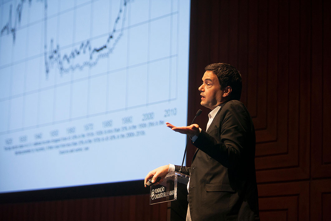
In the newly released World Inequality Report 2018, economists Facundo Alvaredo, Lucas Chancel, Thomas Piketty, Emmanuel Saez and Gabriel Zucman have set out to produce the most complete picture yet of global inequality across nations and over time. Published by Harvard University Press, their 322-page report uses new techniques and previously untapped data sources. In some places, it confirms what we already knew, but the report also busts plenty of myths. Unlike some other inequality reports, it isn’t merely repackaging familiar statistics, but is a fresh crunching of figures.
To see what’s different about the World Inequality Report, we need to recognise how economists have traditionally measured the gap between rich and poor. In decades past, the main data source was surveys asking a random sample of people about their economic circumstances. But following Piketty’s pioneering work in the late 1990s, researchers have perfected an older approach: combining taxation statistics and national accounts data to estimate top income shares.
If you want to measure the incomes of the poorest, surveys are the way to go, since many of them don’t file tax returns. But if you want to know about top income shares — say the income share of the top 1 per cent — then it turns out that tax data provide a more accurate picture. True, top earners sometimes underreport their income to the tax authorities (we’ll come back to that), but this is a smaller problem than the fact that the super-rich tend not to answer surveys. The World Inequality Report gives the example of China, where surveys suggested that the top 1 per cent had 6.5 per cent of national income: a lower level of inequality than in Australia. But new analysis of tax data puts the income share of China’s top 1 per cent at 11.5 per cent, higher than Australia’s.
Taxation data have another advantage: they allow us to learn about inequality over the very long run. Before the 1970s, Australia conducted hardly any income surveys. But the tax data allow us to estimate top income shares going back much further. In one research project, the late Oxford scholar Tony Atkinson and I used Australian taxation statistics dating back to 1912 to trace a U-shaped arc of income inequality over more than a century. These estimates are now regularly updated by University of Melbourne economist Roger Wilkins, using the Australian Taxation Office’s annual release of taxation statistics.
A similar trick makes it possible to estimate wealth inequality using data from inheritance tax returns and rich lists. The University of Greenwich’s Pamela Katic and I produced a long-run series on top wealth shares in Australia going back a full century. As with income, we charted a U-shaped curve, with wealth inequality falling from the first world war onwards, and then rising over the past generation.
The fall in inequality in the mid twentieth century wasn’t unique to Australia. In fact, most English-speaking nations followed a similar path. In the roaring 1920s, the richest 1 per cent of Americans owned half the nation’s wealth. By the 1970s, their share had fallen to a quarter. The distribution of American wealth in the era of The Eagles was considerably more equitable than it had been in the age of the Great Gatsby.
What led America to become more equitable? In the wake of the 1929 stockmarket crash, financial regulation reduced the power of the financier-industrialists who had prospered in previous decades. The New Deal increased home ownership, expanded private pensions and made income taxes more progressive. President Franklin D. Roosevelt recognised that excessive wealth concentration could endanger the social compact, and that prosperity needed to be more broadly shared.
An even more remarkable equalising of wealth occurred in Britain. From 1900 to 1980, the richest 1 per cent of Britons went from owning more than two-thirds of all wealth to only about one-sixth of all wealth. When Edward Elgar was writing the first of his Pomp and Circumstance Marches, Britain was one of the most unequal nations in world history (as measured by distribution of wealth). By the time the Pet Shop Boys were performing “It’s a Sin,” Britain’s wealth distribution was significantly more equal than that of the United States.
One of the chief drivers of Britain’s wealth equalisation was the spread of home ownership. When the first world war came to an end, three-quarters of Britain’s housing stock was owned by private landlords. By 1981, private landlords owned only about one-tenth of properties. As in other European nations, postwar British governments expanded educational opportunities, built a stronger social safety net and implemented policies that helped workers organise collectively for better pay and conditions.
Then, starting around 1980, things began to change. One of the most striking graphs in the World Inequality Report compares the share of income held by the bottom 50 per cent of Americans and the top 1 per cent of Americans. If income were equally distributed, the bottom half would have fifty times the income of the top 1 per cent. Of course, American society has never been close to full equality, but in the 1970s the bottom half did have almost twice the income of the top 1 per cent. By the mid 1990s, though, the two groups had around equal shares. Since then, the top 1 per cent has rocketed ahead while the bottom 50 per cent has languished. On current trends, the top 1 per cent of Americans will soon have twice the income of the bottom 50 per cent.
Income inequality has also grown in many continental European countries, but at a slower pace than in English-speaking nations. Executive salaries have risen much more rapidly in America than Europe. Europe’s stronger pro-worker laws and more generous social safety net have seen a larger share of the gains from growth accrue to the bottom half of the population. A generation ago, Western Europe had a similar level of inequality to the United States. Today, Europe is far more equal than America.
A major contribution of the World Inequality Report is to estimate long-run inequality trends in developing nations — supplementing traditional survey data with tax records to develop a more detailed picture. Adjusting for inflation, the report estimates that incomes for the poorest half of Chinese have grown fivefold since 1980. Yet the top 1 per cent of Chinese are twenty times better off. Part of China’s growing income inequality reflects a divergence between regions. Urban households earned twice as much as rural households when Deng Xiaoping’s reforms began in 1978, but three and a half times as much today.
It is a similar story in India, where real incomes for the bottom half are three times higher than in 1980, but the top 1 per cent are nine times better off. This contrasts with the period from 1951 to 1980, when incomes grew seventeen times faster among the bottom 50 per cent of India’s people than among the top 1 per cent.
These statistics remind us of the risk of focusing on averages. The conventional economic story about post-independence India is that Jawaharlal Nehru and the Congress governments that followed him oversaw a generation of sluggish growth. Only in the past generation, the story goes, has India accelerated from what is disparagingly called “the Hindu rate of growth” to a more rapid expansion. But the picture looks different when viewed from the perspective of the bottom half of the population. For the poorest 50 per cent of Indians, the real gains from the economic growth since 1980 have been similar to those during the years from independence to 1980.
Sudden changes can have an equalising effect, as the two world wars had for European nations. But they can also exacerbate inequality. One of the sharpest increases in inequality recorded anywhere in world history occurred in Russia during the early 1990s. Post-Soviet “shock therapy” allowed those with political connections to capture huge gains from privatisation and sudden market reforms. Rapid inflation and capital flight followed. From 1990 to 1996, the World Inequality Report estimates, the income share of the top tenth of Russians almost doubled.
Yet for most Russians, life was hard in the decade following the breakup of the Soviet Union. Alcoholism increased, and mortality rates rose. Today, the poorest half of Russians have real incomes about one-quarter below where they were in 1980. Since the end of communism in 1989, 99 per cent of Russia’s growth has gone to the top tenth. Putin’s Russia, the World Inequality Report concludes, is probably more unequal than the nation ruled by Tsar Nicholas II.
Equally disheartening is the story of South Africa, where overall inequality today is higher now than it was at the end of apartheid. The black–white income gap has narrowed since 1994, but this has been offset by a large increase in inequality within racial groups. The result is that South Africa’s level of income inequality is higher now than when Nelson Mandela took office. The report estimates that the top 1 per cent share, which had halved from the 1940s to the 1980s, has doubled since the end of apartheid.
If inequality has risen in most countries, then it must follow that the world distribution of income has become more unequal. Right? Well, no. Global inequality — the income gap between all the world’s citizens — depends not only on gaps within nations, but also on the gap between nations.
To see this, imagine that the world consisted of just two nations: China and America. Inside each country, inequality is slowly growing, with rich Chinese outpacing poor Chinese, and rich Americans doing better than poor Americans. Now suppose that China as a whole is growing faster than America, shrinking the income gap between the two nations. In that case, if we were to line up all the people who live in China and America, we might see less overall inequality. That, in a nutshell, is the story of the past generation. A generation ago, the purchasing power of the typical Chinese person was about one-fifth of the global average. Today, average Chinese incomes are close to the international mean.
One way of visualising the distribution of global growth is what has come to be known as “the elephant curve.” A few years ago, Branko Milanović, an economics professor at the City University of New York, combined dozens of national datasets to create a chart showing the growth rates experienced across the world’s income distribution — with the poorest people on the left, the richest on the right, and the global middle class in the centre.
The resulting chart was shaped like an elephant: sluggish growth at the very bottom (the tail), more rapid growth for those between the twentieth and thirtieth percentiles (the back), then weak growth for the middle (the downward curve of the trunk), and spectacular growth among the top tenth (the tip of the trunk). With newer and better data, the World Inequality Report produces a curve that if anything looks even more like an elephant. Strong economic growth in the emerging economies gives a pronounced hump. The squeezed middle in advanced nations traces the bottom of the trunk. And the rising prosperity of the global elite produces the upstretched trunk, pointing skywards.
As well as showing the patterns of global income inequality, a great strength of the World Inequality Report is its analysis of global wealth distribution. Because the poor tend to spend everything while the rich invest in properties and shares, the distribution of wealth is considerably more skewed than the distribution of income. To enter the global top 1 per cent requires wealth around €1 million. That wealthiest 1 per cent now own a third of world wealth, up from a quarter in the mid 1980s.
While the wealthy millionaires have done well, the billionaires have done even better. Using data from the Forbes rich list, the report looks at wealth holdings of the top one-in-a-hundred-million. In today’s world of around 7.5 billion people, that group represents the richest seventy-five people. Over the past generation, those billionaires have increased their wealth three times faster than the global average.
What does the future hold? The World Inequality Report presents three scenarios. The first is business-as-usual, in which inequality continues to rise in each country as it has done since 1980. The second is the United States trajectory, in which all countries’ inequality rises as rapidly as it has done in America over the past generation. And the third is the European trajectory, in which inequality rises at the slower rate that has been seen in that region.
These three scenarios foresee quite different worlds in 2050. Under business-as-usual, the global 1 per cent’s share — now 20 per cent — would rise to 24 per cent. Under the US-style high-inequality growth trajectory, the global 1 per cent’s share would rise to 28 per cent. And under the European-style low-inequality growth trajectory, the global 1 per cent’s share would fall to 19 per cent. Similarly, the income share of the bottom half of the world would shrink a little under business-as-usual, fall significantly if the world followed the US path, and grow significantly under the European path.
How might we get to a world with less inequality? One answer lies in a fairer tax system. “Income tax progressivity,” the report notes, “is a proven tool to combat rising income and wealth inequality at the top.” The authors calculate that a 2 percentage point drop in the top marginal tax rate boosts the top 1 per cent’s share by around 1 percentage point.
Another answer is to crack down on individual tax evasion. Wage earners and pensioners tend not to avoid much tax, since their earnings are automatically reported to the authorities. But massive data leaks from Panama, Switzerland and Luxembourg have revealed significant tax evasion at the very top. On one estimate, the richest 0.01 per cent of Scandinavians evade over a quarter of the personal taxes they owe by using tax havens. Tax havens may account for an even larger share of avoided taxes in other nations.
Multinational corporations have been up to the same tricks. In research released in parallel with the World Inequality Report, Thomas Tørsløv, Ludvig Wier and Gabriel Zucman find that in 2016 Google Alphabet reported revenues of US$19 billion in Bermuda, “a small island in the Atlantic where it barely employs any worker nor owns any tangible assets, and where the corporate tax rate is zero per cent.” Like super-rich individuals, mega-multinationals use tax havens on a massive scale. The economists estimate that around 40 per cent of the profits of large multinationals are shifted to low-tax jurisdictions. Because tax havens have low or zero corporate tax rates, this massively reduces global corporate tax payments. For every dollar paid in tax to a tax haven, five dollars of tax are avoided in countries with regular corporate tax rates.
As well as a fairer tax system, the World Inequality Report calls for countries to ensure more equitable access to education. An example of the problem can be seen by comparing university attendance rates in the top tenth of American households with those in the bottom tenth. In high-earning households, nine out of ten children attend university. In low-earning households, only three in ten attend university. And the quality of the institutions matters too. America’s most selective colleges admit more students from families in the top 1 per cent than from those in the bottom 50 per cent.
In the workplace, the report recommends fairer laws to tilt the power balance back towards employees. Higher minimum wages reduce earnings inequality. Worker representatives on boards can ensure that employees’ interests are not forgotten when making strategic decisions. Careful analysis of mergers can avoid a situation in which a few big firms dominate the product and labour markets.
Egalitarianism is a core part of the Australian story. Mark Twain, Anthony Trollope and D.H. Lawrence all remarked on it when they visited our shores. As one nineteenth-century commentator put it, “In England the average man feels that he is an inferior, in America that he is a superior; in Australia he feels that he is an equal. That is indeed delightful.”
To preserve Australia’s “delightful” egalitarianism, we need to better understand the global trends. The World Inequality Report provides data and ideas aplenty, and a warning of where we may end up if we continue down the current path. But it also suggests a roadmap towards a more equal Australia — and a more egalitarian world. •