
When you say “per capita,” there’s many per capitas. It’s, like, per capita relative to what? But you can look at just about any category, and we’re really at the top…
— Donald Trump, 20 May 2020
On the day the American president uttered those words, World Health Organization head Tedros Adhanom reported the highest number of new infections so far in any single day of the coronavirus pandemic, with 106,000 new cases in twenty-four hours, bringing the world total to 4.9 million cases and 326,000 deaths. No previous pandemic has generated data of this kind so quickly. And while there are inconsistencies in the figures among countries, especially in rates of testing, they do allow a preliminary analysis of what worked and why.
As the chart shows, the total number of deaths by 20 May varied dramatically between countries, with fatality rates among the worst-affected countries at the bottom of the ranking hundreds of times greater than those at the top. (Countries whose statistics are generally believed to be unreliable — including Russia and Brazil — are omitted.)
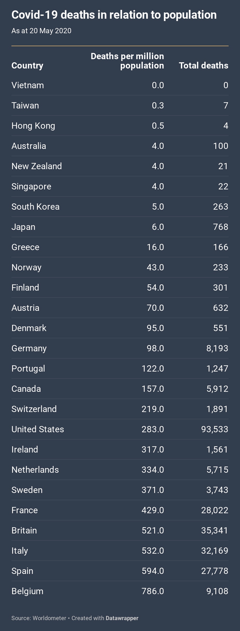
Apart from the East Asian countries, all of these countries are affluent Western democracies whose health systems are able to deliver quick and fairly reliable data on causes of death. They also happen to be the countries most affected so far, with just five — the United States, Britain, Italy, France and Spain — accounting for 70 per cent of all acknowledged deaths.
The figures in this chart are from Worldometer, with most of the data sourced from the Johns Hopkins University database on the coronavirus. They capture the picture as it was on 20 May. Global tables compiled in mid March would have looked very different, with China and Iran at or near the top, and they may well look very different again in a few months’ time. While numbers appear to be slowing in the countries so far most affected, it is feared the virus is spreading to other countries, some of them less well equipped to respond.
The figures almost certainly underestimate the pandemic’s death toll. Some causes of death are likely to have been misattributed, especially in the early days of the pandemic, and data isn’t always consistent between countries. (For a time, for instance, British authorities were including deaths in hospitals but not in nursing homes.) But the figures do reveal important trends.
The chart above is ordered according to death rates per million people. At the top are several East Asian countries and Australia and New Zealand, all with per-million death rates between zero and six. At the other end of the scale are several European countries: by far the worst is Belgium, which shares with Spain, Italy, Britain and France a death rate of more than 400 deaths per million people.
What explains the differences? One factor is luck. Countries that had the misfortune of facing the virus before epidemiologists understood its spread or health bureaucracies had strong enough evidence to persuade governments to take strong measures found that it had spread exponentially, with terrible consequences. The early outbreaks in Italy and Spain, for example, probably made those countries’ rates much higher. The unluckiest country, for a different reason, was South Korea. There, the virus took off among a secretive Christian sect, with 9000 people showing symptoms and infecting others. By the time the authorities found out, the coronavirus had spread widely.
Some say geography is a factor. Containment is certainly much more difficult among mobile populations. Such cosmopolitan destinations as New York, London and Paris were among the first to be hit, and it is hard for contiguous countries with closely meshed economies, like those of Western Europe, to close their borders.
Others point to distance from world population centres as a factor — in the case of Australia and New Zealand, for example — but both countries normally have high rates of international arrivals and departures. Besides, the most successful countries have included those contiguous to China, along with two of the most transited places in the world, Hong Kong and Singapore.
While geography plays some role, the table also shows strong differences between neighbouring countries. Portugal’s mortality rate, for example, is only a quarter of Spain’s. Ireland’s rate is substantially lower than Britain’s. Within Nordic Europe, Sweden’s rate (371) is far higher than Denmark’s (ninety-five), Finland’s (fifty-four) and Norway’s (forty-three). Several countries in northern Europe, notably Austria and Germany, have done better than their neighbours to the south. Canada has a lower fatality rate than the United States.
Luck and geography play a role, but a government’s response is much more important. And in dealing with a virus that proliferates as quickly as the coronavirus, the speed of decision-making is primary. With perhaps 80 per cent of those infected not needing any specialist medical treatment but still able to infect others, this easily transmitted virus can spread silently and speedily through a population. By the time the first case was confirmed in New York City on 1 March, epidemiologists believe, perhaps 10,000 people had already been infected in the city.
Covid-19’s exponential growth meant that time was of the essence. Globally the 1000th death occurred in early February and the 100,000th death just two months later, in early April. The United States registered its one hundredth death on 17 March, its 10,000th death on 6 April and its 100,000th death in late May.
When could governments have reasonably been expected to respond? Suspicions were growing in Wuhan in November and December following a series of strange and unexplained cases of pneumonia. China reported these to the World Health Organization on 31 December. The next day, the Huanan Seafood Wholesale Market, linked to several cases, was closed. The first Chinese death was reported on 11 January.
At that point the provincial and national governments were keeping vital information to themselves. Indeed, in early January, Dr Li Wenliang — who would die from the virus on 7 February — and other medical staff were accused by party officials of making alarmist statements and forced to retract. It was only on 14 January, according to the New York Times, that party leadership decided it was faced with an epidemic.
The Chinese government finally warned its population on 20 January. Three days later it quarantined Wuhan, took drastic action restricting the movement of its citizens, and sent in thousands of medical staff from elsewhere in the country. It can rightly be criticised for its secrecy in the first three weeks of the year, but from then on China was clear about the dangers. The World Health Organization proclaimed a public health emergency of international concern — its highest-level alert — on 30 January. It underlined the point on 11 March by using the term “pandemic,” but the 30 January announcement should have been sufficient to alert governments.
So, from the beginning of February at least, governments around the world should have been preparing for a possible pandemic. No grounds yet existed for lockdown measures, but governments should have been preparing tests, gathering personal protective equipment, ensuring hospitals had ventilators and other needed equipment, storing up masks for the general population, and, in federal systems, coordinating resources and policies among the states.
Taiwan, which monitored the situation in Wuhan closely from 31 December, seems to have been the fastest to respond. It and the other East Asian countries had suffered from several epidemics in recent history — bird flu in the 1990s, SARS in 2003 and swine flu in 2009 — experiences that had no doubt helped them to build expertise and encouraged them to take the threat seriously from the beginning.
Several Western countries, by contrast, were slow to respond. The most bizarre of all was the United States. Donald Trump’s daily intelligence reports had been warning of the threat of a pandemic, yet the president said no fewer than fourteen times that the coronavirus would go away. “We have it totally under control. It’s one person coming in from China, and we have it under control. It’s going to be just fine,” he said on 22 January. “Looks like by April, you know, in theory, when it gets a little warmer, it miraculously goes away,” he said on 10 February; and besides, “We’re very close to a vaccine.” Even as late as 9 March, just two days before he finally announced some dramatic moves, he tweeted, “The Fake News Media and their partner, the Democrat Party, is doing everything with its semi-considerable power… to inflame the CoronaVirus situation.”
These absurdities have real-world consequences, especially when combined with the lack of institutional mobilisation. One epidemiological study by Columbia University concluded that if the United States had begun social distancing a week earlier, 36,000 fewer people would have died from the epidemic by early May; and if they had begun two weeks earlier, 83 per cent of the deaths until early May would have been avoided. A cut-through line the Democrats can now use — which has the advantage of being broadly accurate — is that Trump’s six wasted weeks cost 60,000 lives.
After the death rate, the second key indicator is testing. The chart below ranks countries according to the number of Covid-19 tests carried out per million people, along with the number of cases per million. These 20 May figures again show the importance of bearing timing in mind. Among the European countries at the top, with the highest rates, most testing was done after the pandemic had already taken hold. South Korea doesn’t rank highly, but it did a lot of early testing as part of its very successful containment program and by early March had conducted several hundred more tests per head of population than the United States.
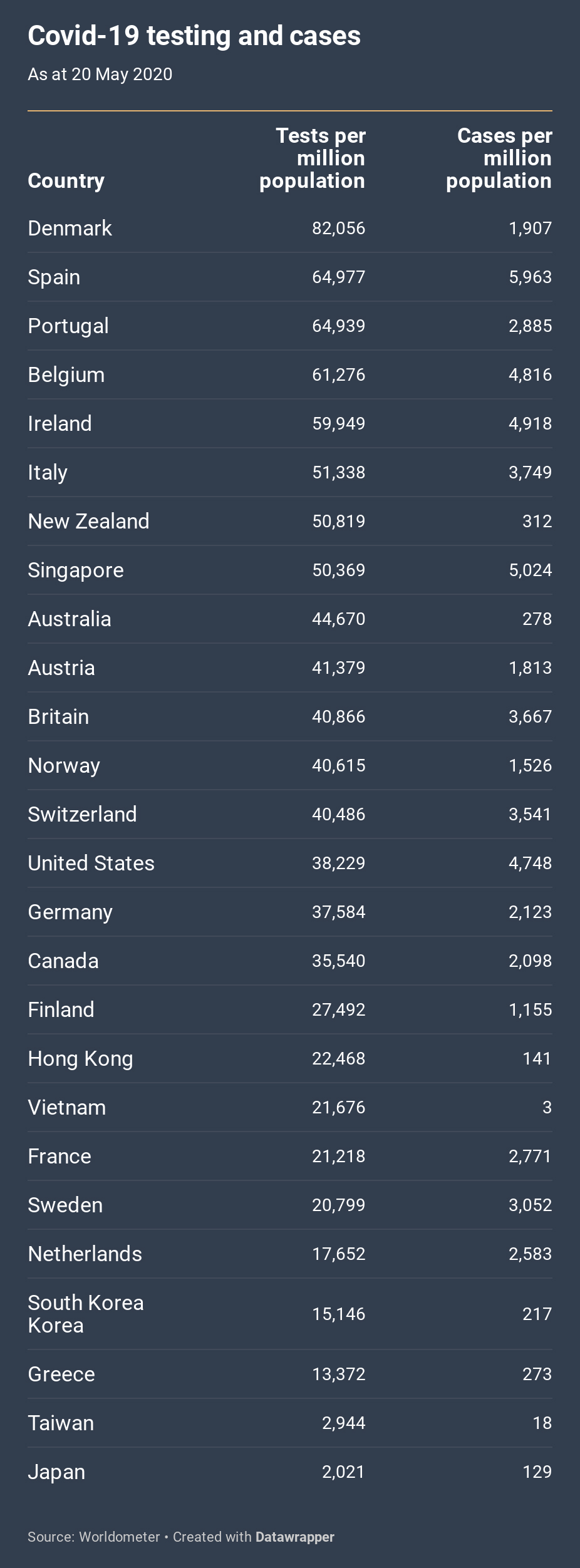
Partly as a result of the lack of a longitudinal dimension, the ordering of the table shows little relationship to the death rates in the first chart. The countries that most successfully contained the virus took different routes to success. Taiwan and Japan succeeded with limited testing; Singapore initially undertook limited testing, but after a second wave it escalated its testing regime enormously.
Perhaps the East Asian countries, with the social discipline that must come from both recent experiences of epidemics and a cultural respect for authority, will be able to contain the spread without extensive testing. But my guess is that in Western societies the scale of testing is going to be a key to reopening economic and social life.
By 20 May the United States’s testing performance was around average among these countries, which contrasts vividly with several clearly false statements by Trump. “We have tested much more than anybody else times two. We’ve tested more than every country combined,” he said on one occasion. “So the media likes to say we have the most cases, but we do… by far the most testing,” he said on another. “If we did very little testing, we wouldn’t have the most cases. So, in a way, by doing all of this testing, we make ourselves look bad.”
The claim that the high number of tests makes it seem as if the United States has a high number of cases is refuted by the second column of the chart, which shows that the United States has the third-highest number of cases per million people.
Rates of cases detected are one thing, but what about different death rates among those who fall ill?
The third chart, below, compares rates of death among the same group of countries; the lower the number, the better. If all countries were testing at the same rate on the same criteria, these figures would reveal a combination of two things: the vulnerability of populations and the effectiveness of medical interventions to save lives. But testing rates, and hence the number of cases identified, differ greatly between countries. Where fewer tests are conducted, they generally target people who already have symptoms or have been exposed to a dangerous cluster; where more tests are carried out, we get a better sense of the extent of infection in the general population.
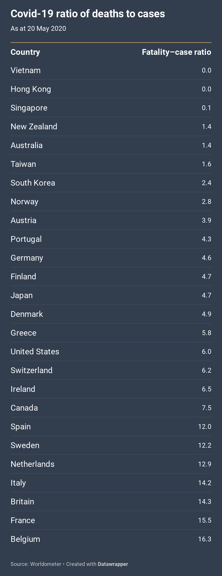
With this important reservation in mind, what does this final chart show? As in the first chart, and with similarities in rankings, the differences are stark. Someone who contracted the virus in Belgium had about twelve times the likelihood of dying as someone in Australia. In fact, Australia, along with New Zealand and the East Asian countries, is at the top of the rankings.
The similarity between the first chart and this one suggests that the most important factor determining a successful response is not the vulnerability of national populations. Japan, for example, has the oldest age structure but a below-average Covid-19 mortality rate. Nor, at least at this crude level of comparison, does success seem to correlate with any longstanding institutional strengths in healthcare systems. Indeed, rather embarrassingly, the Global Health Security Index of 2019 declared the United States and Britain — neither of which could be said to have successfully handled the pandemic — as the most capable among the 195 countries examined.
What the chart points to yet again is the importance of leadership and the speed of response. Rather than reflecting pre-existing weaknesses in their health system, the case–mortality ratio in the European countries, for example, reflects how quickly their health systems were overwhelmed. •
Updated on 9 June 2020 to correct the reference to the WHO’s declaration of a pandemic.