
“We have reached a tipping point,” the secretary-general of the OECD said in 2015. “Inequality can no longer be treated as an afterthought. We need to focus the debate on how the benefits of growth are distributed.” This growing international consensus has been reflected in the creation of the OECD’s Centre for Opportunity and Equality, along with a new focus on inequality at the International Monetary Fund and the World Bank.
Here in Australia, there’s less unanimity. Shadow assistant treasurer Andrew Leigh has highlighted how the richest Australians have taken a rising share of overall income since around 1980, and the newly elected national president of the Labor Party, Wayne Swan, wants to see a renewed effort to reverse that trend. Yet treasurer Scott Morrison says inequality is falling rather than rising.
Part of the disagreement comes down to the question of what we are measuring and over which period. In the decade since the global financial crisis, income inequality in Australia has remained stable or even fallen slightly, but that fall came off a historic high for inequality. There is little doubt that inequality is worse now than it was in the early 1980s. As the IMF reported in its Fiscal Monitor for 2017, “Australia is among countries with the highest growth in income inequality in the world over the past thirty years.”
The Australian Bureau of Statistics’s latest analysis of inequality, released in June, reinforces the point. This is the ABS’s most comprehensive study yet, and not only takes account of the impact of income tax and social security benefits on households, but also factors in government-provided health, education and other community services, along with the GST and other indirect taxes. According to this broader measure, inequality is lower than we thought, but it has risen in recent decades.
At least Australia has enjoyed growing prosperity, Scott Morrison might reply. After all, as the Economist has pointed out, our economy has exceeded the record set by the Netherlands by racking up “the longest stretch of growth in modern history.” This is the message the government highlighted in the budget papers and has used in international promotional campaigns. But when we look at the trends over a longer period, that claim also becomes questionable.
Here, a timely new book from Oxford University Press offers a valuable comparative perspective. Inequality and Inclusive Growth in Rich Countries aims to identify which policies have been successful in limiting the rise in inequality by promoting income growth for those on middle and lower incomes. It analyses in detail the experiences of ten rich countries — Australia, Belgium, Canada, France, Germany, Italy, the Netherlands, Spain, Britain and the United States — over recent decades, showing that stagnant incomes and rising inequality can be dealt with where the political will exists. (Disclosure: I wrote the chapter on Australia.)
A particular theme of the book is a phenomenon that has been called “decoupling,” the process by which the incomes of working-age households have risen more slowly than per-capita gross domestic product. This means that economic growth hasn’t benefited households up to the median level of income — the point at which half the earners receive less and half receive more — as much as it did in the thirty years following the second world war.
What explains this divergence between the growth in per-capita GDP — the measure trumpeted by politicians — and the growth in median household incomes? Basically, the differences come down to the fact that the two sets of figures are collected from different sources for different purposes.
Per-capita GDP is a measure of total domestic economic output, regardless of where it’s consumed; household income surveys only gather information on Australian residents. Certain income sources —imputed rent, retained profits, or in-kind benefits — are included in GDP but not reported in household surveys. Non-responses to household surveys, and misreporting by survey staff, also affect comparability.
Once collected, the two sets of figures undergo different adjustments. Per-capita GDP is adjusted using the GDP “deflator,” which takes account of price changes among all goods produced in Australia. Household income is adjusted using the consumer price index, which takes account of price changes among goods consumed by households. A higher growth in CPI relative to the GDP deflator indicates that households are faced with relatively faster-rising prices.
While GDP growth is expressed in per-capita terms, median income is commonly “equivalised,” with total household income divided by the square root of the household size to reflect the fact that it’s cheaper per person to live together. Because the composition of households is changing over time, a further incompatibility arises: as the average household gets smaller, the economies of scale fall, producing a lower growth in median income compared to a per-capita measure.
Finally, it’s important to bear in mind the difference between “per capita” and “median.” Per-capita GDP growth will outpace median income growth if incomes grow faster in the top half of the distribution.
In Inequality and Inclusive Growth in Rich Countries, Brian Nolan (the book’s editor), Max Roser and Stefan Thewissen apply this distinction to the available data. They show that between 1981 and 2010 real per-capita GDP in Australia grew by an average of 1.83 per cent each year, while real median equivalised household income grew by an average of 1.21 per cent. The gap — 0.62 per cent — was the tenth-highest among twenty-six OECD countries, though only half the disparity for the United States. It is worth noting that about 40 per cent of the divergence in Australia is due to inequality, whereas the figure is about 25 per cent in the United States.
Over the whole period from 1981 to 2010, the growth rate of per-capita GDP in Australia was the equal eighteenth-highest of the twenty-six countries and the growth rate of median income was seventeenth-highest — not exactly world-beating.
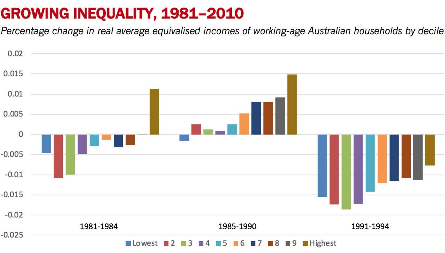
Most importantly, household income growth for working-age households varies dramatically across those years. As this chart shows, the period from the early 1980s to the mid 1990s is very different from the subsequent period.
Source: Our World in Data
In the early 1980s real incomes fell or were stagnant for virtually all households except in the highest decile (the richest 10 per cent). Real incomes grew very modestly in the second half of the decade, again with the exception of the richest 10 per cent. Real average income then fell among all income groups in the early 1990s, but the drops were greater for households below the median than for those above. Incomes grew much more strongly for all groups in the second half of the 1990s and the early 2000s, although the gains were nearly twice as great for the highest-income group as for the lowest. This growth — which had started in 1992 — was only sufficient to get lower-income Australians back to where they had been in 1989.
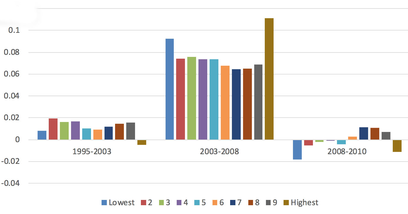
The period from 2003 to 2008 stands out. Real average incomes grew by between 6 and 11 per cent per year for a full five years. Again, the richest did best, but all household groups enjoyed unprecedentedly high rates of growth. Households below the median did better than those in the next four deciles.
Real average incomes for households in the bottom half of the working-age income distribution declined after the global financial crisis, although this time the richest income group also experienced a fall. While the figures are not shown here, income growth has remained modest since 2010, except among poorer age and disability pensioners, who benefited from the Rudd government’s increase in the pension in 2009.
Overall, these divergent patterns of income growth resulted in rising levels of inequality among working-age households. Although incomes rose significantly, all but the richest 10 per cent lost ground. For the sixth to the ninth deciles, income shares were broadly stable until 2003, then fell until the global financial crisis and didn’t subsequently recover.
The share of the richest 10 per cent of working-age households increased from 20.4 per cent to 24.7 per cent. As a result, the Gini coefficient — the most common measurement of inequality — increased from around 0.27 to 0.33 over the period, somewhat less than for the total population (including those of pension age).
Even though income distribution widened among working-age households below the median, these figures suggest that the increase in inequality resulted mainly from the richest pulling far ahead of the median rather than from the poorest falling significantly behind. For the period as a whole, the richest 10 per cent were the only group to increase their share of income.
The most striking feature of these results is the extreme divergence between periods. A period of negative or very low income growth was followed by a period of positive growth, a deep recession, a longer period of solid growth, and five years of supercharged growth across the distribution, culminating in a final period that looks more like the 1980s.
Also striking is the fact that the half-decade from 2003 to 2008 accounts for a very substantial component of the improved living standards households experienced across the whole period. For the lowest three income deciles, those years contributed more than the entire net increase in real incomes since 1981–82 — in other words, without the mining boom they would have gone backwards. For the next two deciles they contributed more than 80 per cent of the total, and for the remainder they contributed two-thirds.
Moreover, the 2003–08 period constitutes a very substantial moderating factor in terms of the overall discrepancy between the growth in per-capita GDP and the growth in median equivalised disposable household income, with real median income growing faster than per-capita GDP by close to five percentage points per year. Indeed, if the 2003–08 period had followed the long-term trend then the discrepancy between per-capita GDP and median income would have been nearly three times as great, and significantly larger than in the United States, although not as large as in several Eastern European countries.
The 2003–08 mining boom and its impact on Australia’s terms of trade look like a once-in-a-generation event that’s unlikely to be repeated, at least in the immediate future. This raises the question of whether Australia is truly a miracle economy, or whether is has once agin showed itself to be a lucky country.
These divergent trends raises two obvious questions. What are their causes, and what role has government policy played in offsetting or reinforcing them?
Let’s start with trends in work-related earnings. Because these are the most important source of income for working-age households, changes in the level and distribution of earnings are likely to be a major contributor to overall income inequality.
The chart below shows trends in the ratio of the ninetieth percentile of full-time earnings to the tenth percentile. This ratio increased between 1975 and 1983, before the first income survey. For most of the next ten years, it remained stable or, if anything, declined slightly. Starting in around 1993, wage disparities steadily increased, then fell slightly at the end of the period. At the beginning of this period, a high-wage worker was being paid about 2.6 times the wage of a low-paid worker; by 2016, the ratio had increased to around 3.3 times.
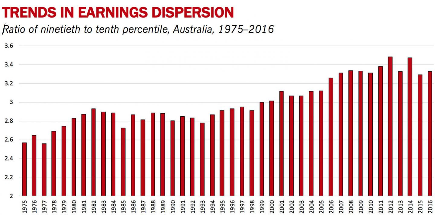
Source: OECD (2017), “Earnings: Gross Earnings: Decile Ratios,” OECD Employment and Labour Market Statistics database (accessed 14 September 2017)
Trends in the labour market also play a role in inequality. The most up-to-date analysis of long-term labour-market changes in Australia comes from economists Michael Coelli and Jeff Borland at the University of Melbourne. They examine two related indicators, job polarisation and earnings disparities.
Job polarisation occurs when high-skill and low-skill employment accounts for a larger share of the job market at the expense of middle-skill jobs. Coelli and Borland’s analysis of data from the 1960s through to 2011 concludes that the share of employment in low-skill jobs increased by 2.2 percentage points and the share in high-skill jobs increased by 17 percentage points. The share in middle-skill jobs, meanwhile, fell by 19.2 percentage points. This polarisation primarily occurred in the 1980s and the 1990s, and was primarily a male phenomenon.
In their analysis of earnings disparities, the two researchers point out that in 2013–14 the lowest decile of income earners worked an average of ten hours per week, and the second decile worked around fifteen hours per week — in both cases mainly as a result of unemployment, non-participation in the labour market, or part-time work. At the other end of the income scale, highly paid full-time workers worked around forty hours per week.
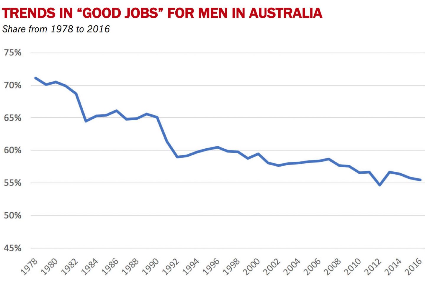
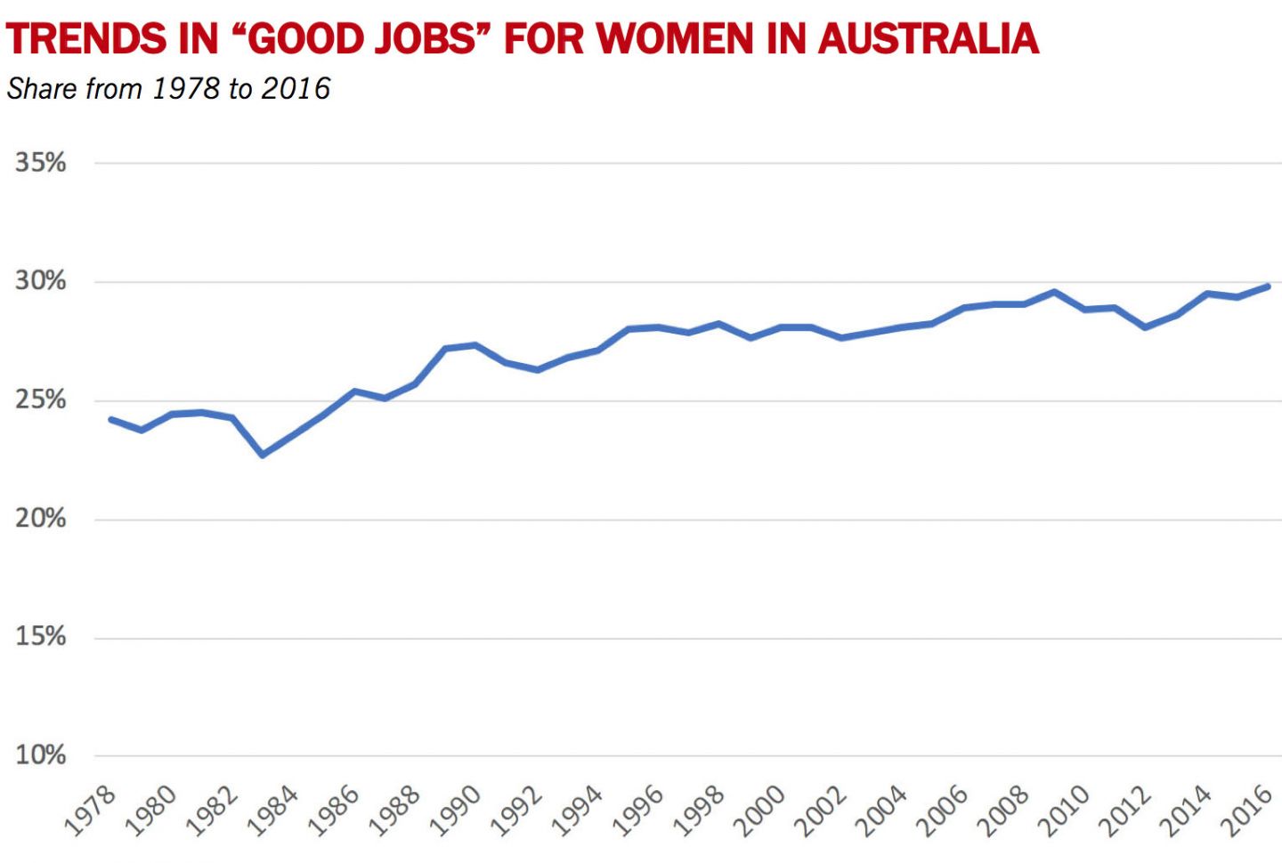
The next two charts show trends in the labour-market status of men and women aged sixteen to sixty-four between 1978 and 2016. They use ABS labour force survey data and figures from the OECD’s wages database to identify the extent of low pay, defined as the percentage of full-time workers earning less than two-thirds of the median. All percentages refer to a percentage of the population rather than a percentage of those in the labour force.
The charts focus on the proportion of the working-age population who can be defined as being in “good jobs” — in other words, full-time workers who aren’t in low-paid employment. They show that the proportion of men in good jobs was above 70 per cent at the beginning of the period. This fell throughout the 1980s and again in the recession of the early 1990s by about 10 percentage points. The figures continued to fall at a slower rate until 2016, with the overall result that between 1978 and 2016 the proportion of men in good jobs fell by nearly 16 percentage points.
Source: Author’s calculations from labour force survey data and the OECD wages database
About a third of that decline is explained by the increase in the proportion of men who weren’t in the labour force (up from 13 to 18 per cent), and another third by men in part-time work who weren’t looking for longer hours. Roughly another fifth of the group, or 3.3 percentage points, was made up of part-time workers who would like to work longer hours. In total, more than half of the total change reflected an increase in part-time work.
While the proportion of men who were unemployed doubled between 1978 and the peak of the 1990s recession, it subsequently fell to the point where it was no higher in 2016 than it had been in 1978. Low pay among full-time workers has increased, but not strongly. Its highest point was just before the global financial crisis, but it only contributed around 8 per cent of the overall change.
The second of these two charts shows the corresponding data for women. The trends run in the opposite direction, with the proportion of women who are not in the labour force falling from nearly half of those of working age to less than 30 per cent. The proportion who are underemployed and looking for longer hours increased more significantly for women than for men, while the proportion of women working part-time but not looking for longer hours rose by close to 10 percentage points. Low-paid full-time female workers made up a slightly higher share of the population at the end of the period compared to the beginning. Overall, women in “good jobs” rose from about 24 per cent to 30 per cent of the female population, which only partly offset the fall in the proportion of men in well-paid full-time jobs.
Source: Author’s calculations from labour force survey data and the OECD wages database
Over the whole period, the share of the total population of working-age in “good jobs” fell from 47 per cent to 41 per cent.
It could be argued that not all part-time jobs are “bad jobs,” and it’s certainly true that the majority of those who work part-time are not seeking longer hours. If we treat people who are happily working part-time as having “good jobs,” then the increase for women would be greater — from around 38 per cent to 54 per cent — and the fall for men would be lower — from 74 per cent to 64 per cent. Of course, this is an upper limit: not all part-time jobs, even if those in them are not seeking longer hours, are well paid.
Both young men and young women may not be seeking longer hours because of study commitments, while many workers may accept low-paid part-time jobs because of family and other care commitments. Nevertheless, the share of part-time work is very high in industries where low pay would be expected. As Jeff Borland has pointed out, 47 per cent of men and 62 per cent of women employed in retailing were part-time, as were 57 per cent of men and 67 per cent of women working in accommodation and food services, and 41 per cent of men and 51 per cent of women working in healthcare and social assistance. These jobs are not likely to be well paid.
Finally, let’s look closer at the period since the global financial crisis. Technically, Australia didn’t fall into a recession during that downturn, partly because the federal government launched one of the largest fiscal stimulus packages among OECD countries. The boost was equivalent to 4.6 per cent of 2008 GDP, with a very large component delivered through payments to households.
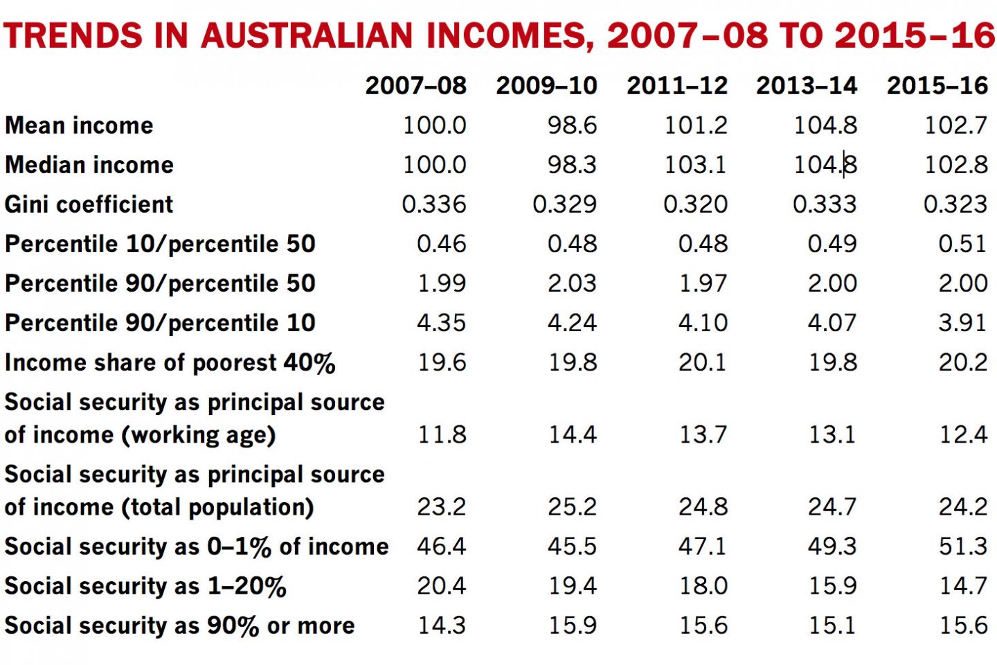
What has happened since then to household income levels and their distribution? The table below shows that by 2015–16 real mean incomes were only 2.7 per cent higher than they had been eight years previously, and real median incomes only 2.8 per cent higher. The Gini coefficient fell from 0.336 to 0.323 — although it was still higher than at any time prior to 2007–08. The reduction in inequality largely reflected a fall in the income of the top 20 per cent, with the self-employed bearing most of the losses.
The income share of the poorest 40 per cent of the population increased somewhat over this period. The ratio of incomes of the tenth percentile to the median increased quite significantly from 46 per cent to 51 per cent, the highest it has been since the income surveys began.
Source: Australian Bureau of Statistics, Household Income and Wealth, Australia, 2017, Catalogue No. 6223.0
Overall, what is most striking about these figures is the very slow growth in real mean and median household incomes — for the median, less than 3 per cent in total, or about 0.35 per cent per year for the previous eight years. This is only slightly higher than the growth rate between 1985 and 1989 (0.23 per cent per year), considerably below the growth rate between 1995 and 2001 (2.1 per cent per year), and much less than the growth rate between 2003 and 2008 (7.2 per cent per year).
Australia might not have experienced a large drop in living standards following the global financial crisis, but the rise in household incomes has slowed considerably and inequality has remained broadly stable. Moreover, the federal government’s social policy priorities have moved more strongly to “budget repair,” with proposed cuts in social security spending likely to have the largest impact on lower-income families. This helps explain why the period since 2012 more closely resembles the late 1980s than the more rapid growth from the mid 1990s to 2008.
“Budget repair” almost inevitably implies that the social security system will become less effective in reducing inequality. Because the Australian social security system targets the poor more heavily than any other rich country, the OECD expects that cuts in social security would increase inequality to a correspondingly greater degree.
The government’s current tax plans will also make personal income tax slightly less progressive. More significantly, the proposed “speed limit” on Commonwealth tax levels will severely limit the government’s capacity to meet the challenges of population ageing and respond to further increases in inequality.
These decisions contrast with the 1980s and 1990s, when the Accord between the Hawke–Keating government and the trade unions brought tax reform — including broadening of the tax base — and improvements in the “social wage,” which partly offset the trends to higher inequality associated with the labour-market changes during that period. •