National Photographic Portrait Prize 2017
National Portrait Gallery Canberra until 18 June 2017, and then on tour
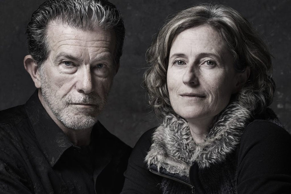
The 2017 National Photographic Portrait Prize, awarded to Gary Grealy’s near-monochrome double portrait of Richard Morecroft and Alison Mackay, has a heightened sense of occasion about it. This year is the award’s tenth, which provides an opportunity to reflect on a decade’s photographing of people’s faces, on what has changed in the ever-changing world of photography and on what has stayed the same. The exercise in looking back is aided by the National Portrait Gallery’s wise decision not to fiddle too much with the original formula: thanks to careful planning, it has been possible to keep criteria and presentation relatively unchanged, making it easier to draw connections between one year’s competition and another’s.
The gallery has issued a small, well-produced catalogue in identical format for each of those ten years, and the works of all the finalists (numbering around fifty per year, some years rather more, some years rather fewer) can be found on the gallery’s (excellent) website, along with an essay by a member of the three-person judging panel summarising trends and making an effort, not always entirely successfully, to refer at least in passing to individual finalists. Several additional features have been introduced over the years – interviews with judges and finalists, a people’s choice award – but by and large the format has remained helpfully consistent for anyone interested in digging deeper into photographic history in the making.
The judging panel – two NPG staff members and an outsider – varies from year to year, but certain names recur, including that of Sarah Engledow, senior curator at the NPG and one of the 2017 judges. In her years as a judge, Engledow has also contributed the accompanying essay. Her commentaries – acerbic, witty, informed, and deeply sympathetic to both photographers and sitters – make essential reading for anyone contemplating submitting an entry in future years; so, too, does her piece in the current issue of the gallery magazine, Portrait, in which she reflects on the decade and selects some of her own favourite photographs.
Engledow is not one to pull her punches – tattoos, she records with evident relief, are now too commonplace to be automatically edgy or interesting. “In the early years of the prize, there were many photographs of tattooed people, but now there are so many tattooed people that photographers have no reason to seek them out.” Other popular tropes – people posing with their pets, for example – continue to abound, but as Engledow freely acknowledges, simply choosing a common theme doesn’t rule out success. Janelle Low won the prize in 2013 with her beautifully composed image of Yhonnie and her cat Indiana, Yhonnie looking serenely contemplative and Indiana looking both contemplative and, interrupting the otherwise serene mood of the image, slightly constipated.
Among the works currently on display, the entry by Daniel Sponiar, an image of Luke the heavy-metal musician, his tattooed arms holding his pet Pomeranian Nacoya, shows that it is possible to combine several repeated motifs of contemporary portrait photography – not only tattoos and pets, but also nudity (Nacoya plays a strategic role here) and hipster beards – and still come up, against all the odds, with a portrait that is both affectionate and genuinely affecting.
This is a dilemma confronting anyone charged with judging a photographic portrait. How do you deal with the repetitiveness of certain themes and counter the criticism, often levelled at competitions like this one, that there are just too many photographs of young men “on the cusp” with their shirts off, or young women in Vermeer- or Rembrandt-like poses, stunningly lit, or people half-submerged in water, or twins. (“If someone enters a picture and it’s a wonderful image of twins, we’re not going to exclude it just because there have been pictures of twins before,” said the curator of photographs at London’s National Portrait Gallery in 2015, responding to general criticism of the Taylor Wessing Photographic Portrait Prize.)
On the other hand, certain trends are under-represented. Rare among ten years’ worth of finalists is an image that questions the medium itself, overtly or implicitly, or highlights how a photograph is made. For that, one has to look elsewhere, for example to the finalists for the NPG’s own 2016 Digital Portrait Award, recently on display in the gallery and still available to view on the website, and particularly to Lucas Davidson’s engaging if overlong video portrait – “13 minutes, 50 seconds (looped)” – entitled “Body Emulsion Detachment.” The artist “aims to challenge the conventions of the photographic self-portrait… [by presenting] the body as an ever-changing image held together by a thin film of photo emulsion.”
More strikingly, perhaps, very few images here are selfies or allude even faintly to this latter-day phenomenon, and few have the look of having been taken spontaneously or “on the run.” For that, it may be argued, there are now competitions in mobile or smartphone photography. In the recently announced results of the international Mobile Photography Awards, Brisbane photographer Glenn Homann won the People category for his photograph of a laughing dancer in mid-leap, caught at a point where she is superimposed on a background image of a “partner” while suspended above her own shadow. It is a complex photograph, one that implies an immediate “before” and “after” in a way that the portraits in the NPG exhibition – alluding much more deliberately to established conventions of portrait photography – tend not to. Daniel Sponiar’s Luke is a case in point, with his otherwise unconventional subject posed formally against a plain cloth backdrop in the manner of an early twentieth-century studio portrait.
You can sometimes sense the underlying tension created by the need to present a single defining image while recognising that a single image can never be the full picture. This tension sometimes emerges from the titles and the accompanying text, in which finalists can be at pains to point out that the photograph on display is one of a series, or part of a bigger project. For this year’s National Photographic Portrait Prize, and for the first time since the competition’s inception, the judges chose two works by each of three photographers: Charlie White, Brett Canet-Gibson and Peter McConchie. Each of the six images stands on its own merits, but their selection does nevertheless represent a departure – a nod, however tentative, to the growing preference for favouring portfolios over the single, striking image as embodying the essence of a photographer’s work.
Over ten years of portraits by some 500 finalists, one thing is noticeable: you can clearly see the faces of almost all the subjects. This may come as no surprise, given that this is a portrait competition. Yet it does rather gloss over the fact that the practice of obscuring the faces of subjects with veils or shadows or vegetation or the subject’s own hands – or for showing cut-out holes where the faces should be, in the manner of the found polaroid images collected by Dutch photography curator Erik Kessels – is now so widespread as to be a convention in itself, a convention that for good or ill has largely passed the National Photographic Portrait Prize by.
Not entirely so, of course. There is usually one and sometimes several examples each year of the technique of obscuring to reveal. This year’s display, for example, includes Chris Budgeon’s “Ricki,” who sits shirtless with his back to us. Budgeon, here a finalist for an impressive fifth time, cleverly exploits conventions both old and new; his portrait of Ricki alludes, in pose and tonality and lighting, to the practices of nineteenth-century Australian art and art photography while referring equally strongly to more recent conventions. This serves as a reminder that photography is a creature of convention, whether the conventions date from a century and a half ago or from last week. The trick in portrait photography is not to circumvent those conventions – they are too powerful and will outwit you in the end – but to acknowledge and exploit them, and by doing so to convey the unique eloquence of the individual subject. •
