When another Newspoll dropped this week (51–49 in the Coalition’s favour, again) the Australian mentioned a change in how its pollsters will be estimating two-party-preferred figures between now and the federal election. No longer will they simply slot in the flows from One Nation recorded at the 2022 election; they’ve decided those numbers, 64.3 per cent to the Coalition and 35.7 to Labor, are not quite pro-Coalition enough to be accurate.
Why? Polling boss Campbell White cites two sources suggesting higher flows to the Coalition: Queensland’s state election outcome last year and the results of the pollster’s prodding of federal respondents. The Australian only mentions One Nation, but it’s possible Newspoll is applying this fiddle to other minor parties.
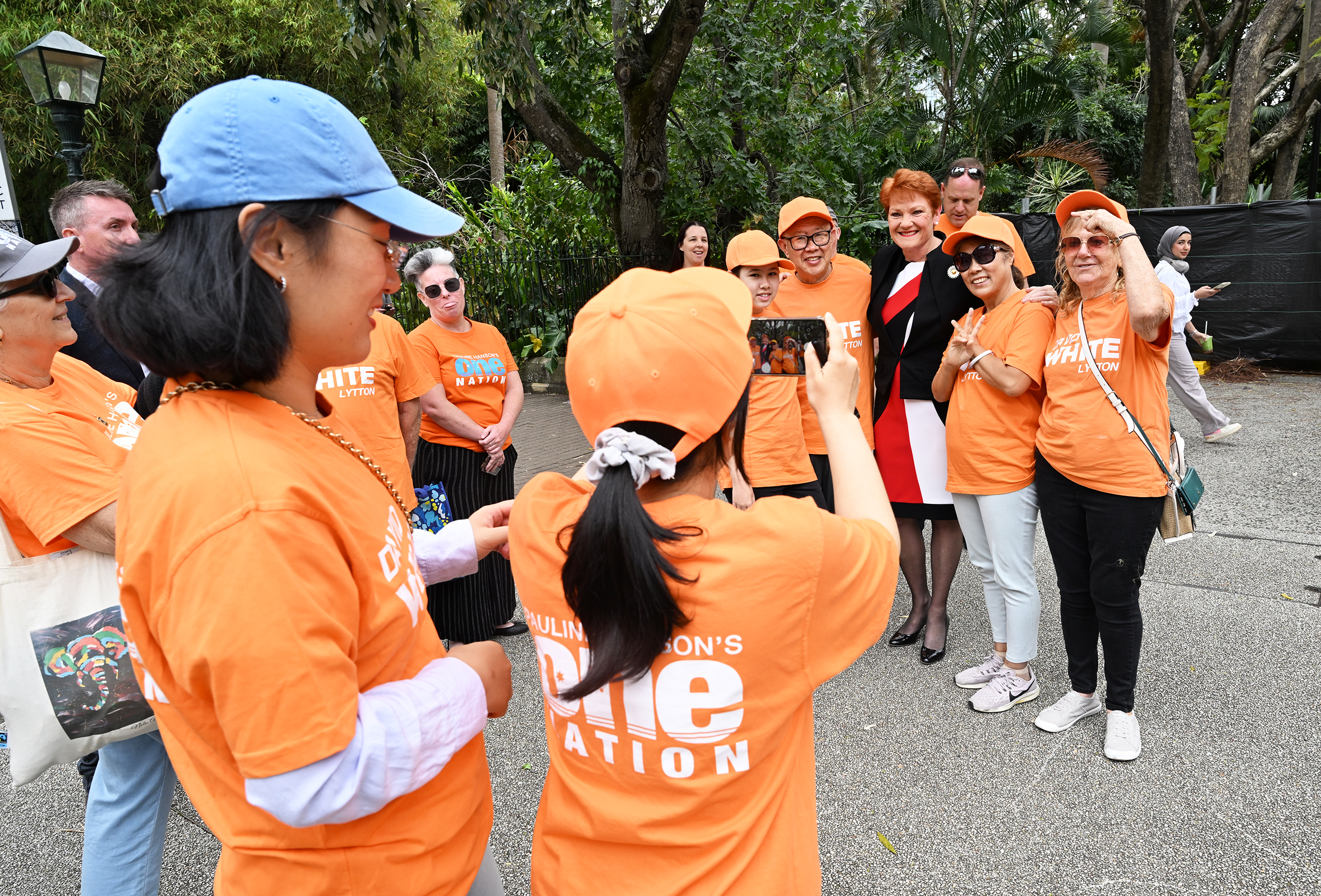
The ABC’s Antony Green calculated that 73.8 per cent of One Nation’s preferences flowed to the Liberal National Party in Queensland last year, which was indeed significantly up on 66.2 at the 2020 state election and higher than the Queensland component of the 2022 federal election, at 66.9. But we don’t know anything more about the other part of Newspoll’s calculation: what federal respondents are telling them (and other pollsters) about their preferences.
Using the last election’s preference flows has been pretty much the standard for estimating two-party-preferred numbers. Some pollsters, such as Resolve and Morgan, usually go further, giving two sets of figures, one derived in that way, and the other from how respondents say they will allocate preferences.
But the last election’s flows are not sacrosanct, and adjusting them like Newspoll is doing can make sense. Labor received an exceptionally high proportion of flows from the larger minor parties and independents in 2022 compared to earlier elections. (You can see the 2004 to 2022 data here.) In fact, had preferences flowed in 2022 as they did in 2019, Labor’s national two-party-preferred vote would have been 51.2 instead of 52.1 per cent. That’s a big difference when pollsters’ estimates are hovering around 51 for the Coalition and 49 to Labor, as they are now. If you applied 2019 flows instead of 2022 to recent polled numbers, you’d nearly always turn that rounded 51–49 into 52–48 (both in the Coalition’s favour).
So it’s reasonable for pollsters to second-guess preference flows. And it does seem unlikely that, in total, they will favour Labor quite so much in 2025.
Newspoll’s One Nation adjustment might make a 0.2 to 0.3 per cent difference to the national two-party-preferred numbers, which is not to be sneezed at. But it’s the Greens who are the biggest source of potential impact, simply because they attract so many votes — generally around 12 per cent in the polls. (Unlike most other minor parties, not all Greens preferences end up being distributed: in some electorates they reach the two-candidate-preferred count. But that’s irrelevant to the object here: calculating national two-party-preferreds.)
There is some evidence, though inconsistent, that minor-party flows move in line with the overall two-party-preferred vote. So, for example, Queensland as a whole swung 7.0 per cent to the LNP in last October’s state election, and One Nation preferences swung 7.6. Another example, again in the northeast state: the massive 14.0 per cent swing against the LNP in 2015 included better flows to Labor than expected and largely accounted for virtually everyone incorrectly anticipating the outcome.
But that tendency doesn’t seem to apply as much to the Greens as it does to the minor right-wing parties. Greens supporters have long been seen as relatively “high information” voters, sure of which major party they prefer. They are not particularly swayable by how-to-vote cards, despite the fact that they routinely boast the highest numbers of volunteers thrusting the things into people’s hands.
The figure of 5 per cent was long ago calculated as the difference between the Greens “preferencing” Labor and preferencing neither side, but these days, with the party attracting more than twice the level of support, it’s possible a greater proportion of their voters are “lower information” and more susceptible to being influenced by cards. At the level of individual electorates at least, there does seem a positive correlation between Greens support and the flow of preferences to Labor.
But back to the pollsters. Counter-intuitively, asking supporters of non-major parties which big party they’ll preference doesn’t usually get results that stand up well on election day. One reason might be those how-to-vote cards.
I also have a theory (from anecdotal evidence; there is no good data on this) that most voters don’t really understand how preferences work and consequently many of them tend to not take much care with how they allocate them. If you ask a 2022 One Nation or UAP voter which major party they preferenced, there’s a good chance they won’t remember. So pollsters who instruct minor party supporters to choose one of the major parties aren’t successfully replicating that part of the ballot box experience.
If I’m right, then a randomness enters preference allocation when it comes to actually voting, and perhaps a spot of partial donkey voting, which pulls flows closer to 50–50 than pollsters had picked up.
Other polling outfits, like YouGov in its recent giant-sample MRP poll, don’t ask respondents to choose Labor or the Coalition but instead present a bunch of parties (plus “Independents”) and ask respondents to rank them. That should get better results, but still can’t account for how-to-vote cards.
Speaking of that MRP poll (short for multi-level regression with post-stratification), YouGov’s methodology page shows the preference flows it uses for each minor party. This is something no other pollster has published as far as I know, and is very, very welcome. YouGov says it derived these numbers from a “blend” of how its respondents ranked the parties and “historic flows between parties at previous Australian elections.” The Greens figure, 79 per cent to Labor, stands out because it’s smaller than at recent federal elections, which were in the low to mid 80s at the last four outings, peaking at 85.7 in 2022. As this comes from a “blend,” it’s reasonable to infer that YouGov’s respondents have been delivering a proportion lower than 79, perhaps something roughly around 75 per cent.
Maybe that’s about what Morgan and Resolve are getting too, which, along with One Nation–fancying respondents’ higher (than at the 2022 election) stated flow to the Coalition, would help to explain their regularly better respondent-allocated numbers for the Coalition.
Maybe the biggest preference problem lies with independent candidates, who hold all manner of political positions. In 2022 their preferences flowed to Labor in record proportions, to the tune of 63.8 per cent, partly because of strategic voting for teal candidates among Labor and Greens supporters. At 5.3 per cent, it was also a historically high independent vote. Can we assume that around 64 per cent of their preferences will flow to Labor again? This is something we might change our mind about during the campaign if we see a surge in one type of independent or another.
It has to be said that most polling misfires have been due to bad primary numbers, not bad preference assumptions. In 2022 most pollsters simply overstated Labor’s support (and were partly saved by more-than-expected preferences for Labor). (2019 was, of course, a much worse pollster performance.) But we outsiders have little idea how the pollsters got those primary numbers — what weighting and sampling and secret sauces they employ — and are left to pontificate on the wording of questions and the assumptions about preferences. And their track records; as written previously, I’ll be particularly waiting for Resolve’s final campaign poll — or at least its primary-vote data.
In relation to preferences, the difference between 75 (about what YouGov seems to get from respondents) and 85 (about the 2022 election figure) is 1.2 per cent of the national after-preferences vote, which is potentially crucial. (That’s assuming the Greens get roughly 12 per cent support again.) So how they flow in 2025 will be a major point of interest.
In the meantime, it would be nice if pollsters shared their respondent-allocated flows, party by party.
And there’s something else they could reveal that would add to everyone’s bundle of knowledge: demographic data — including age, income, education and gender — for minor-party voters who say they’ll preference Labor versus those who say they’ll preference the Coalition.
How, for example, does a Labor-leaning One Nation voter differ from a Coalition-leaning one? I’d love to see that, and so would you.
Come on pollsters, share more data. •