Anthony Albanese is riding a wave. True, his personal ratings are not as high as they were six months ago, and the budget might scrape off more Teflon, but in the polls, the party room and the media he seems unable to do much wrong.
This time last year that particular cookware-coating descriptor would have been the last to come to mind in describing the Labor leader. Halfway through the election campaign, “charisma bypass” might have been more appropriate for an uninspiring, somewhat blundering opposition leader whose demeanour contrasted with the incumbent’s energetic confidence. Whatever you thought of Scott Morrison, everyone agreed, he remained a formidable campaigner, while Albo, even within the famed “small target” paradigm, erred on the side of saying as little as possible. And his campaign, to put it mildly, was not blemish-free.
The published opinion polls from March 2022 to the election did put Labor comfortably ahead after preferences but found nothing to celebrate in Albanese’s approval ratings. Were they better than Bill Shorten’s had been three years earlier? Arguably, but you had to look closely to see it. They might have been similar to Tony Abbott’s during the last change-of-government campaign in 2013, but even the much-deflated Morrison usually bested him as preferred/better prime minister.
But when the election result became clear at approximately 8pm AEST on 21 May 2022, Albanese went from zero to hero. If observers had previously struggled to imagine him as prime minister, their perspective changed the moment he became one, or at least one-elect. Suddenly it all made sense.
Had he been a good opposition leader? He won, didn’t he, so he must have been.
Now we are used to Albanese as calm and capable PM. From the highest office in the land he pulls the levers of state with ease and aplomb, authority oozing from his pores, journalists hanging off his words. One day he is hobnobbing with the international great and good, the next munching a white-bread sausage sanger at the footy with the hoi polloi. Is there nothing this everyman can’t do?
And because, despite all the accoutrements of high office, he still decidedly lacks personal magnetism, some close politics watchers judge that — you guessed it — his very ordinariness, his unthreatening lack of eloquence, these are the secrets to his success. So he is more a John Howard than a Kevin Rudd.
On the other side, Scott Morrison quickly became an embarrassing, somewhat demented punchline. And the less said about the federal opposition, led by the faintly ridiculous figure of leader Peter Dutton, stripped of his powerful portfolios, the better. Did this clown show really run the country for eight and a half years?
Elections are routinely followed by shifts in public perceptions of leaders and parties, and the most dramatic come after a change of government and/or a result that has turned out to be different from what was widely anticipated. (Some Newspoll examples are here.) In Albanese’s case, this graph from Essential nicely illustrates his huge leap in stature.
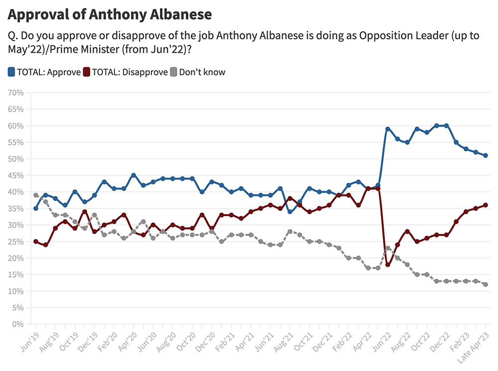
The shape of the graph shows the total reinvention, in the public mind, of the persona of one Anthony Norman Albanese.
The moral of this long-winded introduction? If you want to measure public perceptions of Albanese as an opposition leader you should survey them when he is doing that job. Ideally, you do that as close as possible to when people vote, but certainly before 6pm Saturday eastern time, when votes start to be tallied and the how-and-why tales start to unfold.
And that’s exactly what the regular public polls — Newspoll, Essential, Resolve, Ipsos et al. — did during the campaign.
There is, however, one election survey, much used in academia and often cited in the media, that attempts to measure voters’ attitudes to leaders — along with a host of other factors that influence votes — but collects its data after the election. And not just a few days after, but weeks and in many cases months afterwards. That’s the Australian Election Study, or AES.
Run out of the Australian National University, the AES began at the 1987 election, in some ways as a successor to the Australian National Political Attitudes Surveys. Its counterparts overseas include British and American surveys.
These days the AES is mostly done online. It contains a large number of political questions and a veritable census of demographic ones, most of which are usefully repeated at each election, allowing for comparisons over time. Its sample sizes (2508 in 2023) are a bit on the low side for analysis of some of the cohorts, but its strength is in its breadth of content and repetition across the decades.
Late last year, as after every election, the AES team released a report, some datasets and various accessories. Its trends paper, in particular, has fascinating graphs showing (in some cases) dramatic changes in attitudes on immigration, abortion, the republic, attitudes towards democracy and other topics.
But its huge weakness, all but fatal, lies in the fact that, as its website puts it, the AES is conducted “post-election.” Respondents completed the 2022 survey, for example, between 24 May and 30 September, an average of thirty-two days after the election.
Among the findings given in the forty-page 2022 report is one that received substantial media coverage: “Anthony Albanese was evaluated more favourably than any political party leader since Kevin Rudd in 2007, scoring 5.3 on a zero to ten popularity scale.” This is the relevant graph:
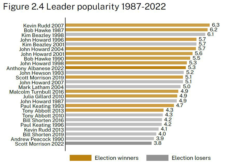
But we know that’s not really how Australians saw the opposition leader at the time of the election, and nor is it what the publicly released polling said. The most popular leader on either side since 2007? You only have to go back to the surveys from the 2019 campaign to find a party leader more popular than Albanese: Scott Morrison. Malcolm Turnbull in 2016 was also rated more highly, even scoring a few net positive results (approval greater than disapproval) during the campaign (something Albanese never did). Julia Gillard in 2010 provides another counter-example.
And the AES’s report itself, in a summary of the Morrison government’s final term, describes the Labor leader entering the campaign in a “not exceptionally popular or inspiring” way.
Beneath the report’s headline, “popular” turns out to mean how much the leader is liked, as in “using a scale from zero to ten, please show how much you like or dislike the party leaders.” That’s a slightly different question from satisfaction and approval; so might that be true of Albanese? Contemporaneous data on this specific question are much scarcer, but what I could find also jarringly contradict the AES.
A Newspoll of “leaders’ character traits” published in March 2022, around ten weeks before the election, had 51 per cent finding Albanese “likeable.” According to Newspoll’s chart, which went back to 2015, that was a much lower proportion than the 68 per cent who said the same about Malcolm Turnbull six weeks before the 2016 poll. Even Bill Shorten managed a higher score in May 2016 of 57 per cent.
Yet in the AES graph above, Turnbull (2016) languishes five spots below Albanese (2022). Could Turnbull have become so much less liked between late May and 2 July? Could Albanese have dramatically grown in likeability during his campaign? Anything is theoretically possible, but the best evidence — satisfaction/approval ratings taken during the campaigns — didn’t show a dramatic rise or fall for either man.
The much more likely reason for Turnbull’s low spot on the AES’s graph is, again, the fact that the survey was conducted after — an average of thirty-eight days after — the last person voted. The 2016 election result, which was significantly worse for Turnbull’s government than was widely expected, provoked a rather bitter election-night speech about Labor’s “Mediscare” campaign. It also set the Liberal leadership hares running, generated universal adverse press coverage and had some in the wider Liberal movement (think Sky After Dark) calling for his head. From then until his demise a little over two years later Turnbull was under pressure — and behaved like it.
This was the prime minister respondents were scoring — just as Albanese’s relatively high “like” score can’t be disentangled from his election success and subsequent popularity in office.
The AES’s retrospectivity affects not just leaders’ ratings but also many other questions probing respondents’ attitudes to issues that might help explain the election outcome. It even includes a question about when respondents made up their minds whom to vote for.
I believe the timing pollutes the responses, rendering much of the AES’s data all but unusable. It’s such a shame given the expertise and expense and skill of the people involved, and the hours they put in. But as far as I’ve ever been able to tell, no one associated with the study believes the timing matters. And nor, presumably, do most of the dozens of academics who analyse the data and present these findings at conferences and in refereed papers in journals.
The sheer length of the questionnaire presents challenges. It skews the sample to people who are willing to go through the arduous process — namely, those who are particularly interested in politics. Attitudes to elite institutions (like the university whose name appears on the survey) might influence people’s decision to participate: only 2.1 per cent of 2022’s respondents said they voted for One Nation or the United Australia Party, for example, which is less than a quarter of the actual 9.1 per cent at the election.
This is probably unavoidable for a long-form survey like this, and in theory weighting (which they do, using actual election results as one of the ingredients, and provide in a separate field) should ameliorate much of it. But the regular pollsters, with a less demanding workload for respondents, probably obtain more representative raw data.
Then there are two long-term, corporate habits of presentation in the various AES reports that are at least in theory fixable.
One is the definitiveness with which the findings are presented. The very first in last year’s report provides a perfect illustration. It reads: “A majority of voters (53 per cent) cast their ballots based on policy issues, down from 66 per cent in 2019” and “just 11 per cent did so based on the party leaders.”
Now, call me difficult, call me pedantic, but deriving such firmly stated conclusions about voters’ intentions from their multiple-choice responses to the question “In deciding how you would vote in the election, which was most important to you?” (available answers: “The party leaders,” “The policy issues,” “The candidates in your electorate” or “The parties taken as a whole”) is absurd, even leaving aside the timing issue.
Many people like to think they’re rationally deciding their vote on policy matters but are actually driven by emotion, tribal loyalty, resentment or just the vibe. We can probably all agree that a healthy economy is, all things being equal, more conducive to re-election than an unhealthy one. On the other hand, longevity can prove an insurmountable obstacle for any incumbent. Neither of these dynamics can be captured in that question. We’ve all met people who always vote for a particular party but justify it by referencing something else. The campaigners, if they’re doing their jobs right, are influencing voters in fleeting, subliminal ways.
And what about those who just reckoned that after nearly nine years of this government it wouldn’t hurt to give the other side a go? Humans are deeply fallible when it comes to understanding, let alone elucidating, their own motivations. There’s a reason why many pollsters have psychology degrees.
So, the AES reckons that in 2022 most people’s votes were largely driven by the parties’ and candidates’ policies. The believability of that might depend on what we mean by “policies.” Does it, for example, include perceptions of the fruits of past policies, such as those of Labor’s last stint in office, 2007–13?
Now, asking the question itself is not without value. The relevant 1996–2022 graph in the trends paper is worth a look — the “policy” line is ridiculously high, but the interest is in the fluctuations. (The two peaks are at the 1998 “GST election” and 2019.)
Changing the wording to “a majority of voters… claimed…” and moving the finding down the list to deprioritise its significance would have been much less misleading. And in the second finding, in fact — “The most important issues in the election identified by voters included…” — the words I’ve italicised make the statement much more defensible.
My complaint here isn’t about a few missing words in one finding. This mode of presentation is a key feature of the AES across its thirty-five years, and comes from an ingrained inability to acknowledge human complexity, both individual and collective. It flows through all the AES reports and associated papers. (Political scientist Murray Goot covered a lot of this in a strongly worded review of a book based on AES findings a decade ago.)
It even turns out, according to the AES, that you can use its data to calculate the value of various drivers of the election outcome. An example from 2019 is that “[b]ased on… voter responses, it is estimated that the net effect of leadership [Morrison versus Shorten] on the vote was 4 per cent against Labor.” This is calculated by taking the proportion who nominated “The party leaders” as the key factor in the question mentioned above, splitting them up by whom they said they voted for, and applying them to the actual election results.
The arithmetic was not repeated in 2022, and giving it a go myself I could see why: it gives Labor an advantage that rounds to zero, which is surprising if you’re dealing with a face-off between the most and least popular leaders since 2007. The closest we get is “With Anthony Albanese as party leader, Labor attracted more votes based on leadership than in the 2016 and 2019 elections.”
I don’t believe it is possible to quantify leaders’ influence on votes. (Should we try, for example, to account for the fact that any other leader might not have made Shorten’s decision to take a big policy suite to the 2019 election?) But if there is a way, this ain’t it. And across the decades calculations of this nature abound.
The other bad habit of the AES is a tendency to write for media headlines.
Political journalists and commentators have an awful tendency to cast (a) the latest election result and (b) the latest opinion poll as representing the new normal, as how voters henceforth will behave. You can observe it today, fuelled by the Aston by-election; these voting snapshots are assumed to showcase patterns as they will always be, and the prognosis for whichever side lost the last (by-)election (and is trailing in the polls) is dire.
Last year’s general election, the first Labor has won in more than a decade (and since 2007 if we’re talking about majority wins), suddenly became evidence of the Coalition’s inability to ever again form government — and here, says the AES, are the reasons. That’s despite the fact that these supposedly fatal electoral drivers didn’t prevent the Coalition from winning the previous three contests.
This Sydney Morning Herald article, headlined “Young Coalition Voters an Endangered Species,” could’ve been published today but is in fact dated September 2009, when the Rudd government was still riding high. AES data back then showed that the Coalition faced intractable demographic hurdles, namely a lack of support among young voters. This was a popular theme at the time, but we know what happened soon after, beginning with 2010’s tied election. Those seemingly insurmountable demographic changes were somehow surmounted, and then it was Labor that faced an existential challenge, due to (other) demographic developments.
In 2023 we’re back with the Coalition at death’s door — because of young people again, and this time specifically “millennials” (voters born between 1981 and 1996). In some cases the individuals singing from this song sheet were only two years ago administering last rites for Labor.
We expect data nerds and academics to be constrained and sober in their analysis, not to be permanently trapped in the present and not to succumb to the hot take. But sadly it ain’t always so.
The 2022 AES report makes quite a big deal of the Coalition’s deteriorating support among young people. “Between 2016 and 2022, millennials record a large decline in Coalition support, falling from 38 per cent to 25 per cent in just two election cycles,” it reports. “Changes of this magnitude and this pace are rare in Australian electoral history.”
I’ve reproduced its graphs below, and you can see that the starting point of 2016 for millennials (middle bottom) wasn’t chosen at random. It was a year the AES found to be exceptionally good for the Coalition among this age group, better than at any time since 2004.
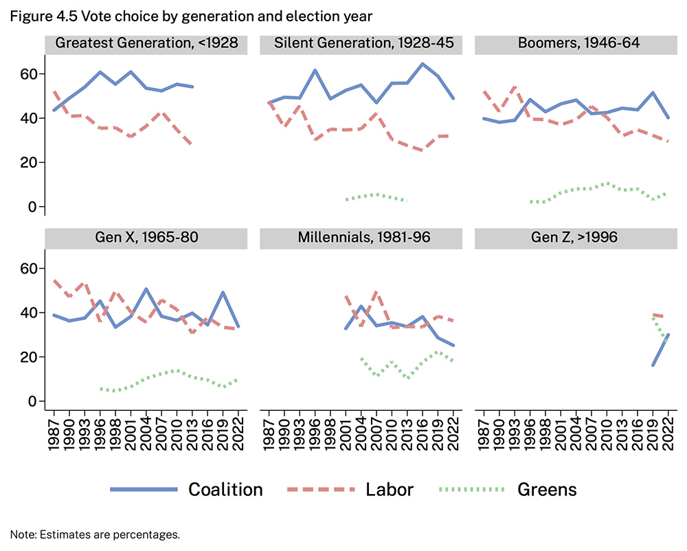
Now, these rather gimmicky age cohorts are no doubt used for popular digestibility. In particular, millennials’ membership has not been constant over the graph; those born in 1996, for example, didn’t join the electoral roll until 2014. And the sub-samples are rather small — just 251 people aged twenty-five to forty-one participated in last year’s survey, implying about a 6 per cent error margin. But let us accept that these figures truly reflect the relevant component of the full electorate.
That 2016 election did exhibit some unusual swings, with the Labor opposition doing very well in low- to middle-income urban electorates, even snatching the hitherto bellwether seat of Lindsay, while the Liberals shored up their wealthy safe electorates. The persona of the ultra-rich, urbane and progressive prime minister Turnbull must have played a part, and perhaps millennials disproportionately warmed to him. That’s interesting, for sure. But to present these figures as a neutral point in the data is simply cherrypicking.
Further down, less sensationally, the report notes that “millennials entered the electorate in the early 2000s with about 35 per cent of this generation supporting the Coalition, a level which has now fallen to 25 per cent.” Is that a big drop? The “Coalition’s historic low levels of support among younger voters” in 2022 can’t be interpreted meaningfully on its own. There are two crucial pieces of context that should be taken into account.
The first is the Coalition’s rock-bottom primary vote in 2022. That 35.7 per cent was the smallest since the formation of the Liberal Party in 1944. Record low support in the aggregate should be expected to translate to low support across most cohorts; there should really only be a sub-headline when one group of people deviates significantly from that shift. Does the AES show a bigger drop among millennials than among the rest of the electorate since 2001?
It does a bit. The ten-point decline since 2001 sits within an overall drop of 7.2 per cent in the Coalition primary vote, from 42.9. A 2.5 to 3 per cent difference (we are subtracting a rounded number from an unrounded one, and giving “2.8 per cent” as the outcome does go against my grain) is still worthy of note. (A trend line over those dots produces something a bit smaller, around 2 per cent.) So, on this evidence, the last two decades have seen an outsized drop in Coalition support among young people. But what happens if the Liberals choose another Turnbull-like leader?
The second missing piece in the gloom and woe about the Coalition’s irretrievably dire situation is that in 2022 Labor’s national primary vote was also historically tiny; at 32.6 per cent it was even smaller than the Coalition’s (it was this fact which made the “net effect of leadership” calculation unpublishable) and was Labor’s nadir since at least the 1930s. Surely if we insist on using primary votes as indicators of electability, this can’t be ignored.
Under our federal compulsory (full) preferential voting system, preferences from other candidates produced a two-party-preferred Labor win of 52.1 to 47.9. The Coalition’s 47.9 was not by past measures spectacularly bad; not as low as in the last three elections (2007, 1983 and 1972) that turfed them out of office. But its current lower-house presence is proportionally smaller than at any time since (again) the Liberal Party came into being, and that’s because nine of the electorates in which it defeated Labor in two-party-preferred terms were won by an independent or minor party instead. That’s a function of its low primary vote. But Labor also missed out on seats in this way — seven, in fact — and that’s because of its low primary vote.
That the AES deals only with primary votes is increasingly problematic, although it’s not clear how to fix the issue. But Labor’s historically small primary vote must, by definition, also translate to splash-friendly depths in some cohorts. On the AES age numbers one could craft a terrifying tale about “boomers” and the “greatest generation,” and to an extent generation X drifting away from Labor. (The more popular one until last year had to do with lack of support among a shrinking working class.) Except, of course, Labor formed government, and so analysis like this doesn’t fit the narrative.
The big story about Australian electoral behaviour is, or should be, the continuing decline of primary votes for both major parties. It’s the two-party system that is under existential pressure, not just whoever happens to be in opposition today, and the record-sized crossbench is the most obvious symptom.
Labor is currently in office. One day it won’t be. One day also Peter Dutton won’t be Liberal leader, and the opinion polls might start to look more competitive. Commentators, finding themselves on the other side of the fishbowl, will simply internalise and recite the current vibe. Academics, I hope, won’t.
Analysing election results is serious stuff. When we write and say things, we should really mean them. It’s better to remain silent than announce a conclusion from a piece of work that ticks all the statistics boxes but rests on hopelessly flawed assumptions.
The individuals involved in the AES are smart, well-credentialled and statistically literate. Most of the data they collect, which don’t purport to deal with the hows and whys of the election results, make for excellent observation and, in their comprehensiveness and multi-decade extent, are unique. The problems lie in some institutional practices
The AES isn’t alone in the academic world in producing statistics-based work in this glib genre. But it does run a big, important poll, widely used, whose post-election aspect is a big flaw. If its personnel found a way to have their surveys completed before election night the value of their data would increase immensely. Not claiming to quantify the unquantifiable with simplistic calculations, and avoiding playing to the media zeitgeist, would improve their reports. •